There’s a lot of rules in painting, and sometimes we even follow those rules.
I think a lot of the rules come from this idea of how things will look.
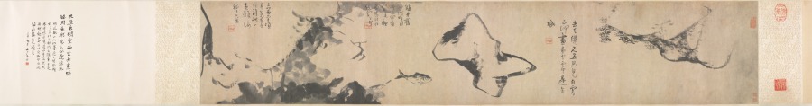
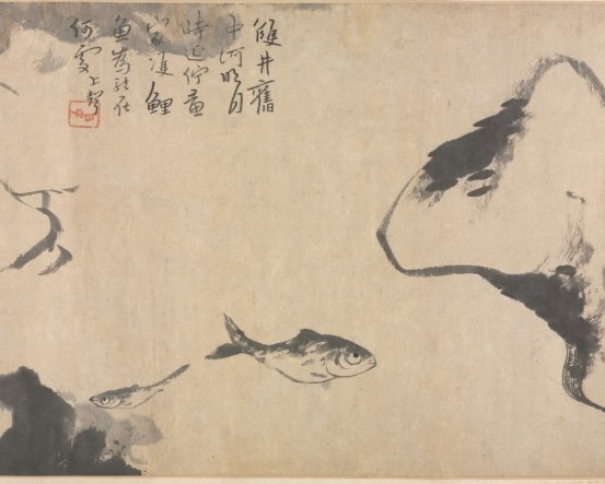
In this painting, Fish and Rocks (魚石圖), by Bada Shanren (八大山人), he paints the eyes of the fish in such a way that they jump forward, allowing other elements to fall back into the background. The eyes have crisp edges and are deep black. The values are deeper and the edges clearer than the areas around them, thus making them feel closer and jump out at us. This gives a life and an energy to the fish as felt through their eyes. There’s a Chinese saying, paint the dragon, dot the eyes, or 画龙点睛(hua long tian jing), which refers to putting the finishing touches on something and bringing it to life.
We tend to think that we are supposed to paint things so that they look accurate and realistic. But if we go to the museum and look at some paintings, a lot of them are not painted that way, and there are usually good reasons for it.
There are things that artists are trying to do and ways they’re trying to change space. We talked about shifting pictorial space in a previously (see this blog post).
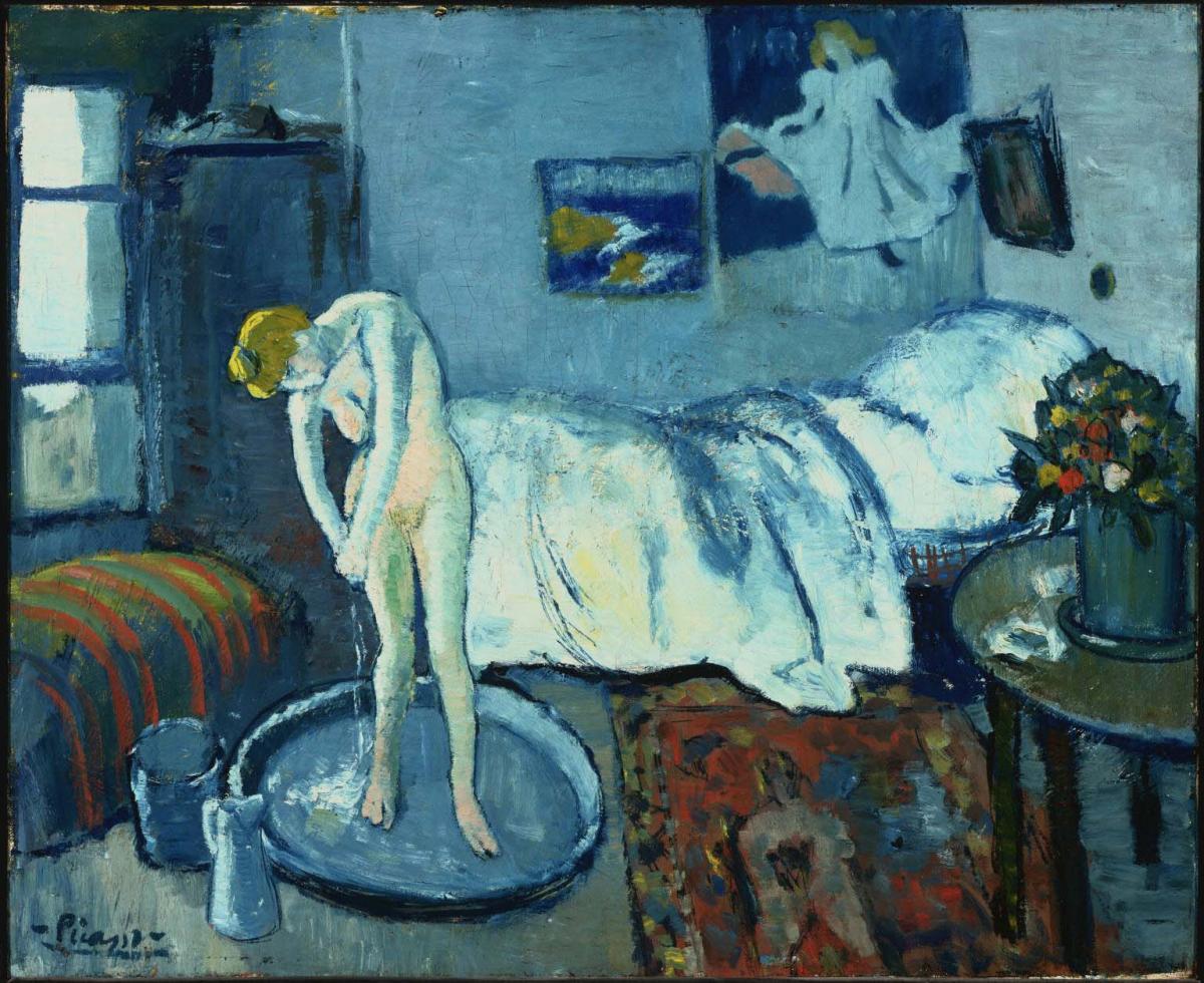
If we had the idea of looking at something like a book, but looking at the whole thing, both pages, at once so we can see the whole space, all at once. I called this “tipping up pictorial space.” We see this with Matisse, with Cézanne, see it with Persian art, Chinese art. We see it in a lot of different art, and it certainly breaks with the idea of linear perspective.
When considering the idea of clarity in paintings, we are taught that things that we see that are closer to us are more clear, and as we get further away, things get progressively less clear. If we go out into the world, that’s how we tend to see things. But it’s not always how we experience things. In other words, we look around. We don’t just, look at one place and don’t move as we experience the world. We explore, we look around, we move, we move our head, we move our whole body, and we explore the space.
In a lot of paintings, we are trying to do that, and artists are trying to explore those concepts in different ways. Previously, we talked about some examples of artists both creating clarity in the artwork and also shifting that a little bit. And there were two main concepts, two main ways that we saw that artists were creating clarity. One is atmospheric perspective where the idea that as things get further away, they tend to get more blue, they get softer, and also the value range shrinks. So that as things are closer, we can have, a very strong white and a strong black, and a large contrast in values between a strong white and a strong black. Whereas, as we get further back, there tends to be less value contrast because we don’t see as many values. Things get softer, the value range gets more compressed as we move back in space.
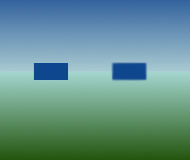
Value contrast plays an extremely crucial role in all of this. If we look at this example, we can see the white inner square contrasted with the black outer square stands out really, really clearly. We can see that immediately. But as we move to the other example, we have, have a gray inner square and a slightly darker gray outer square, and that contrast is not going to draw our attention in the same way. We might see it, but if we’re looking at a painting, if we’re looking at any scene, we’re going to see that very strong value contrast, that black and white or, very dark gray and a much lighter gray, a strong value contrast. We’re going to see that much more clearly, much more quickly. It’s going to draw our attention.
Artists use this idea of strong value contrast not only to draw our attention, but also to adjust the speed with which we move through a painting. Where do we look? How fast do we look? How long are we looking at something? All of these are very important concepts and value contrast, as well as edges, how we handle atmospheric perspective. These are some of the ways that we can affect how we’re moving through the painting, where we look, the speed, the feeling of it, what draws our attention, what becomes more important, what stands out.
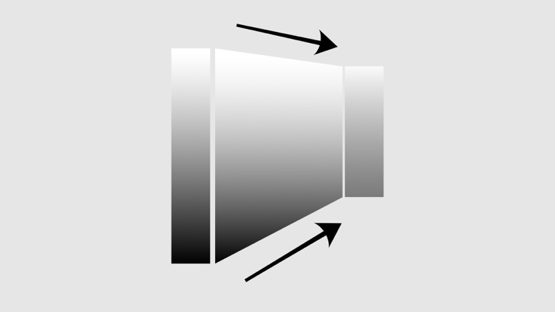
Edges are extremely important, and they’re a part of atmospheric perspective and value contrast. In this example, we have this box that we see very clearly. If we soften the edges, that same box seems to move back in space. The only difference between these two boxes is the edges, the way I’ve treated the edges. I’ve softened the edges in one, and that tends to shift it back in space, versus the other, in which the edges are crisp, and that tends to sharpen it and move it forward. We feel it. We feel it moving more towards us.
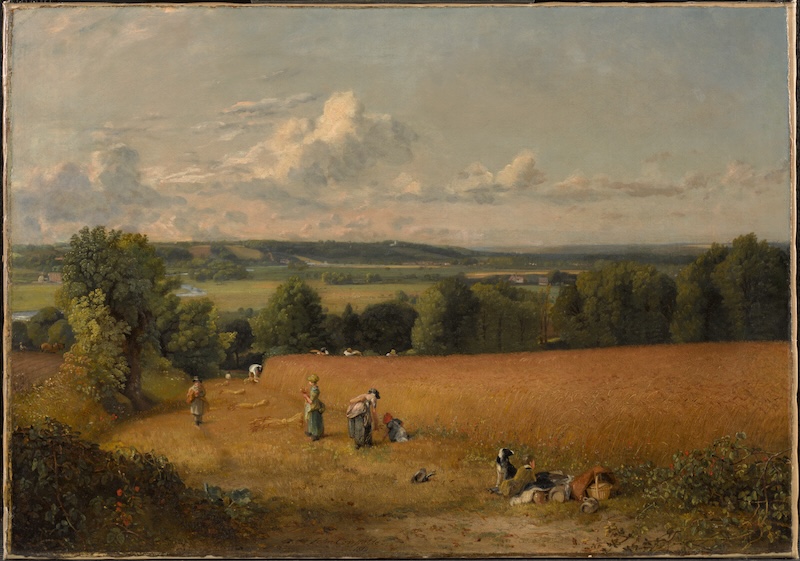
In this painting by Constable, the trees and people closer to the foreground are clearer than even those right behind the wheat field. In the foreground, we can make out individual leaves in the trees and details of the people, whereas right behind the wheat field, we see only overall shapes of trees, hints of highlights and movements and groups of leaves, and very little detail on the people working in the back of the field.
Clarity, in general, is closely related to what we saw with edges. We tend to see closer objects more clearly and with more detail, while distant objects become less clear and less distinct.
Normally, as objects move back in space, their edges will become softer and less distinct, as we see here in this painting by Rembrandt, Landscape with a Mill, by Rembrandt from 1645. It’s often just called “The Mill,” probably because the mill features so prominently.
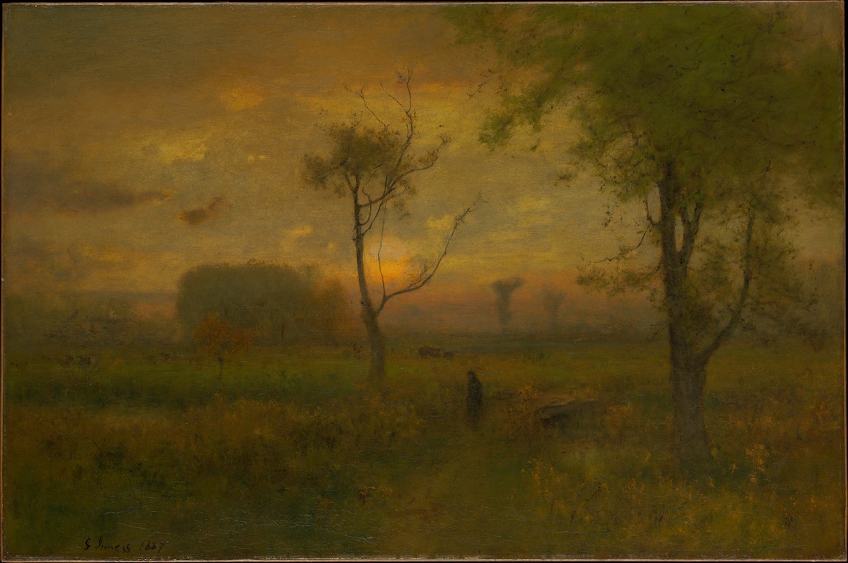
George Inness used this technique of softening edges to create atmospheric paintings which express his deep feeling and reverence for nature. That is, he took this idea where we see softer edges as objects recede in the distance, and he used it more than we might normally expect to create these atmospheric paintings by having so much softness, and everything starts to fuse together. Everything starts to talk to each other. Things are distinct, but there’s a bit of a fusing as well. We see the trees, we see the path, we see everything, but there’s a great softness that leads us into the sense of a vastness and a depth of nature, and we’re led to feel the connection between everything, because everything’s softer and everything’s melding into one great whole.
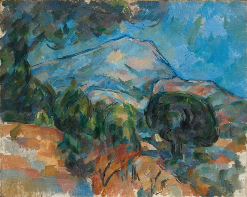
However, Cézanne, in his effort to change the sense of pictorial space, often wants to pull distant objects closer. In the painting Mont Saint-Victoire, he does this by sharpening the edges of the mountain in order to bring the mountain closer to us, without changing its size. The lines around the mountain are strong and clear, with sharp edges and a deep, saturated blue. Not the blue of something disappearing far off in the distance of atmospheric perspective, but rather a blue that is close and present, that speaks of being strong and full.
Edges are really crucial for creating pictorial space, for manipulating pictorial space. It’s one of the things that we can use to shift things. We can soften areas, we can make areas stand out more, and we can play with a lot of subtlety. We can play with it in very interesting, very soft ways. We can kind of feather it here in the same line. It can be crisp in some places, then soft, and then become crisp again. We can create rhythm and movement and move space forwards and back just by playing with a line or an edge.