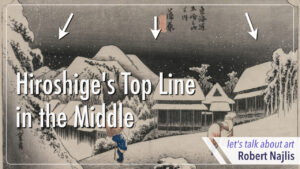
Let’s take a look at these prints by Hiroshige and see if we notice something unusual. If you look at the top, it’s actually pretty wild. Every one of them has something very distinct and common.
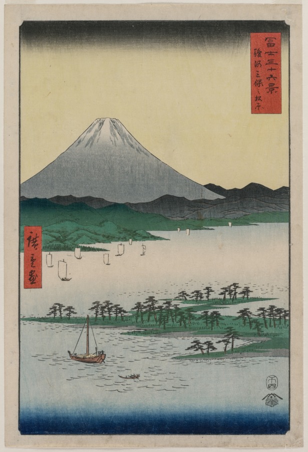
You’ll notice that Hiroshige consistently has a strong line on top of each of his prints. Not on every single one, to be sure, but pretty close. Almost every one. In fact, it takes some searching to find one where he doesn’t do this
This technique that Hiroshige is using isn’t new or a mystery or a secret. It’s called Ichimonji bokashi. It means straight line gradation or single character gradation, because a character for the number one in Japanese is very close to a straight line.
The horizontal line that he’s creating across the top of his prints gets a little softer and lighter as it goes down. This is achieved by dampening the wood block and brushing the ink into the water, so that there’s a subtle gradation as it goes down into the water.
Hiroshige was a Yukio-e artist. Yukio-e means floating world pictures, this was a genre of art that was very popular in 17th to 19th century Japan. Yukio means floating world, and this concept originally comes from the Buddhist idea of the suffering in life and working to get beyond that suffering. But at that time in Japan, it was used in a slightly different way in the sense of their suffering, their world, life is fleeting, so let’s enjoy it while we can. So, kind of similar to the Buddhist concept, but also kind of completely the opposite of the Buddhist concept.
Famous Sites of the Capital (Rakuyo
meisho kan’yu-e), ca. 1722-1744
Hiroshige specialized in landscapes and nature. He also incorporated Western perspective techniques in an effort to add depth and realism to his landscapes. We can see this kind of spatial perspective in contrast to the more traditional Japanese perspective, which is shown here in a section of the painting by Kawashima Shigenobu from the 1700s.
Hobby Horse Walking Past, late 18th century – early 19th
century
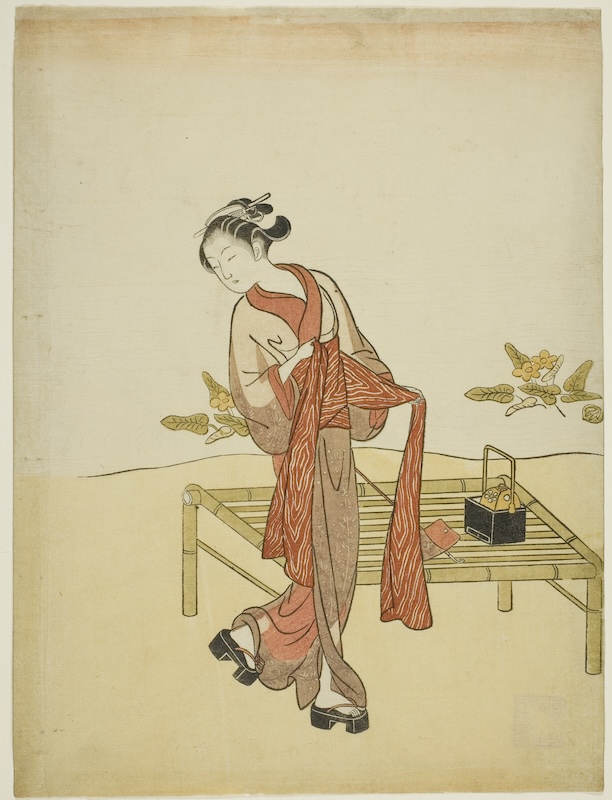
Hiroshige was using the technique of a graduated line in the mid-1800s, but he wasn’t the only printmaker to use it, nor was he the first. We can see Hakusai, another famous printmaker, using it at around the same time. Hiroshige’s teacher, Utagawa Toyohiro, also used this technique. In fact, its use started even earlier. Utagawa Toyoharu, the founder of the Utagawa school, which Hiroshige later joined, also used this technique. As did Suzuki Harunobu. Suzuki Harunobu was the first printmaker to create full color prints as opposed to two or three color prints.
However, none of them employed this technique nearly as frequently as Hiroshige. While we can see Toyohiro using this on occasion, and Hokusai uses it with a fair amount of frequency, but as often as not, Hakusai doesn’t use it. With Hiroshige, on the other hand, it’s hard to find an example where he doesn’t use this technique. Hiroshige used it in almost all of his prints. It seems like almost a trademark of his work.

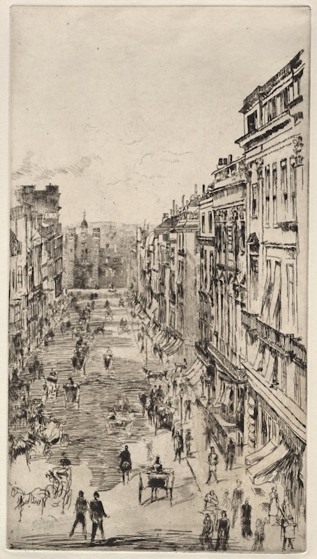
If we go looking for other examples of the similar technique outside of the Yukio-e tradition, it becomes quite hard to find. If we look at Western printmakers, we certainly don’t see this. For example, here we see a few prints by Rembrandt and by James McNeill Whistler, and we don’t see this technique being used at all. Often the skies are open and clear, or perhaps with some clouds creating some color or even some darkness, but never with this kind of graduated straight line technique that goes completely straight across the whole print.
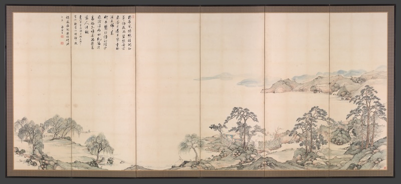
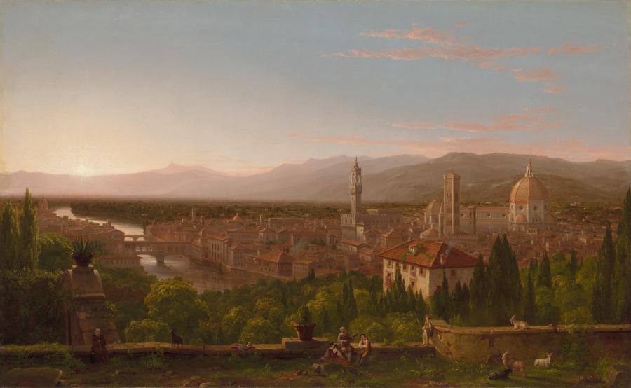
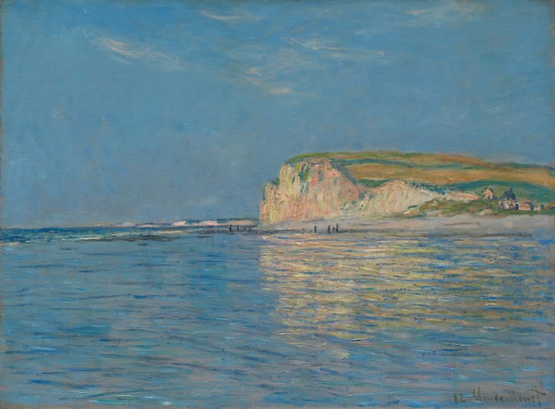
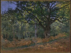
We don’t see it in painting either, whether Japanese or otherwise. For example, this painting, Lake Biwa in Four Seasons by Nukina Kayoku from 1834. And we don’t see it in Western painters. For example, here’s a painting by Thomas Cole, and this painting by Monet. None of these paintings have this kind of straight line technique going straight across the top of their painting.
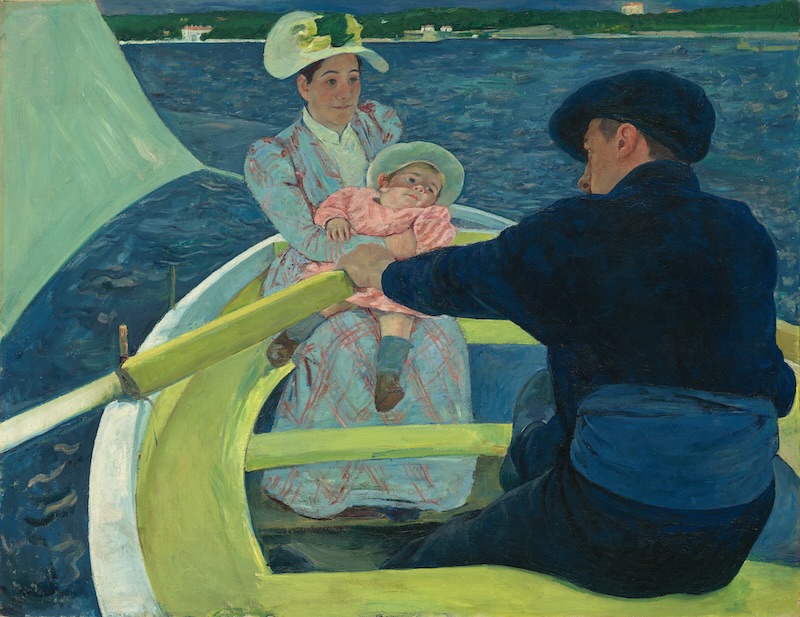
Actually, I should probably amend the previous statement just a little bit. As quite a number of artists around the impressionist and post-impressionist time were influenced by the Yukio-e prints that began arriving in France. And so we can actually see this technique, or at least something quite similar to it, here in the painting The Boating Party by Mary Cassatt, where she’s created a line on top of the painting very similar to that of what Hiroshige did. We discussed this painting in detail in previous post.
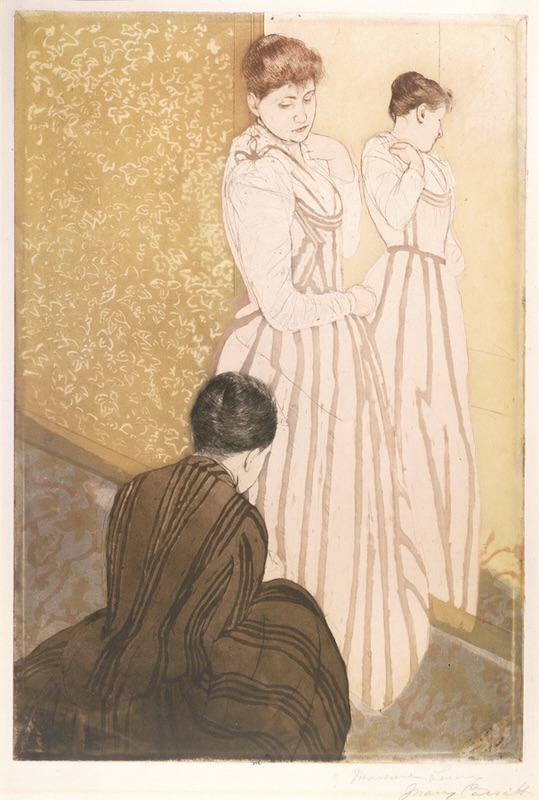
Cassatt owned prints by Hakusai, Hiroshige, and Utamaro. She also produced a series of 10 prints in 1891, which she claimed were done with the intention of attempting an imitation of Japanese methods. We can see an example of one of these prints here called The Fitting.
But let’s get back to the straight line gradation technique. Given that it’s such a unique technique, it invites the question of why use it? What’s it accomplishing? And in particular, how is this affecting the pictorial space of the work? I think the best way to understand this idea is to play around with it and see what we discover. So let’s take a look at what’s happening and see what we can find out.
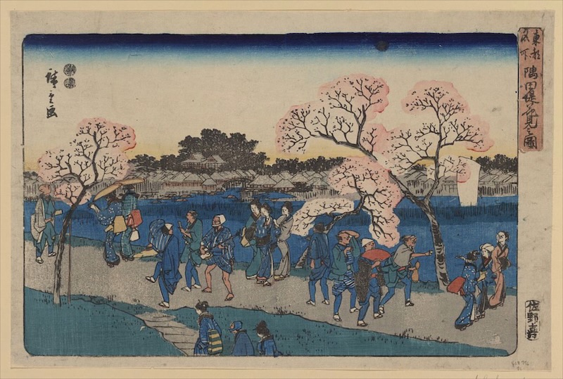
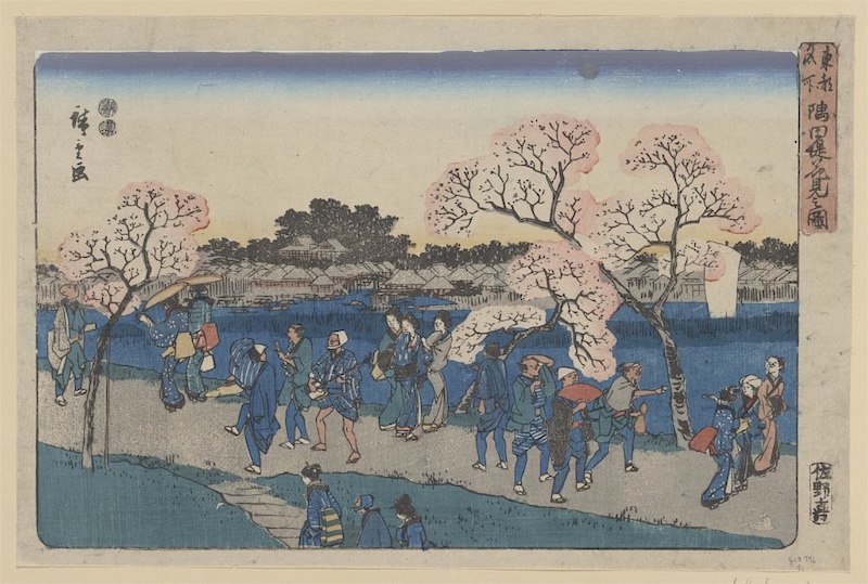
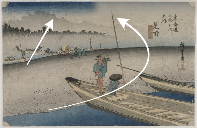
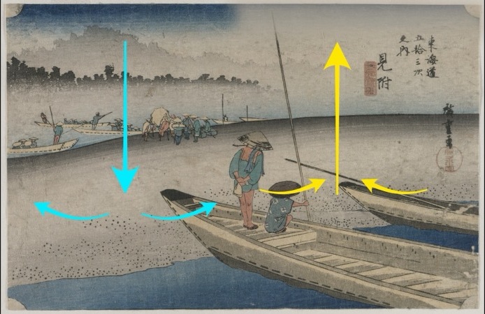
Here’s a print by Hiroshige titled Viewing Cherry Blossoms around the Sumida River. As we’ve seen with so many of his prints, it has a strong graduated line across the whole top of the print.
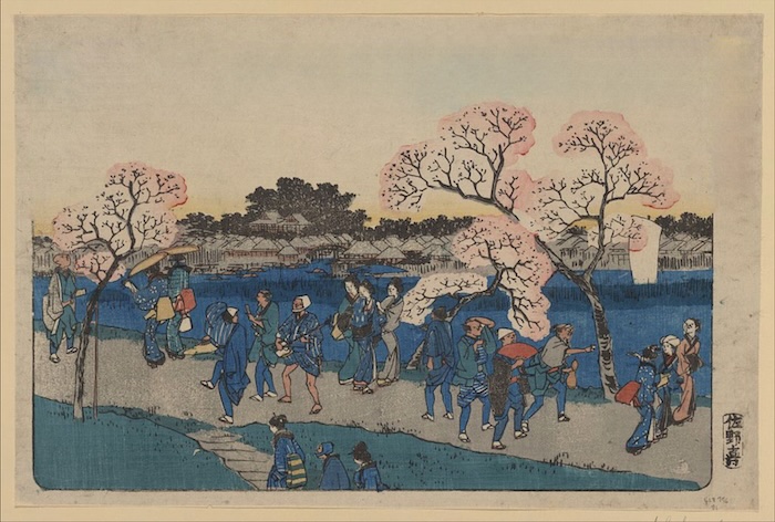
Now let’s try something fun. Let’s remove it completely and see what happens. if we remove this line from the top of the print, it’s a really drastic change. Now when I look at this, there seems to be a huge hole on the top. But really, if I compare this to some of the western prints that we saw before, we can see that it’s really quite similar. It follows the same often seen idea of a light or a clear sky over the landscape. However, coming as we are from the original print with that top line, it significantly changes our viewing experience. For one thing, I now focus much more on the bottom of the print and I tend not to look up at the upper part of the print as readily. In one sense, and perhaps counterintuitively, this tends to make the piece feel smaller as my focus stays on the bottom and it doesn’t go up to encompass the whole work. However, when I do go up to the top, I also tend to get locked into looking up there. So there’s a bit of a feeling of two separate pieces, the top and the bottom, two separate places with much less connection between them. However, there is also an aspect in which not having this top line allows the space to breathe more with nothing to block it in. That top line can give a feeling of pressing down on the space and it can kind of let us feel a little bit locked in or pushed down.
Removing the top line was a fairly bold move. We can try something a little less dramatic. Let’s try lightening the top line and see what happens. This is probably more in line with how people might expect the sky to be painted. Light, but present and not overwhelming. It’s fairly effective. It does get us moving towards the top of the image and it helps to keep a connection between the top and the bottom. It’s certainly not as dramatic though and it doesn’t bring us up to the top of the space as strongly as the original. It’s more of a reminder that the sky and the upper part of the artwork are there and it helps to keep the piece from feeling too small or becoming too divided into two separate parts of the top and the bottom. We also don’t feel the same difficulty of finding it hard to breathe due to the heavy line at the top. It’s much more akin to what we more commonly see in terms of the strength and color of the sky, even if it’s not so common to see such a straight line across the top. And it certainly does lose some of the drama of the original print. This line at the top extends horizontally across the whole piece. I think that’s one of the things that stood out to me the most. The fact that it goes across the whole piece that there’s no break in the line.
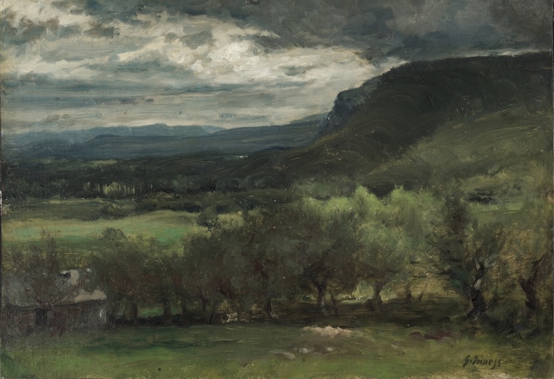
We do see works with some dark areas on top such as the painting Montclair by Georges Inness. But what’s rare is to see a line so straight and discreet that covers the whole width of the piece.
But of course, as we mentioned earlier, we do see it in the boating party by Mary Cassatt. As with Hiroshige, the shoreline at the top of Cassatt’s painting is very strong. It covers the whole width of the painting. And what that does is it moves that space forward. It moves it forward so much that it feels like that back shoreline is almost touching the woman’s hat. In fact, in some places it feels like the shoreline and the hat are painted with almost one brushstroke. By engaging our vision in this way across the whole span of the painting, it helps to carry our focus across the whole width of the space. I discuss the shoreline and the painting in separate posts.
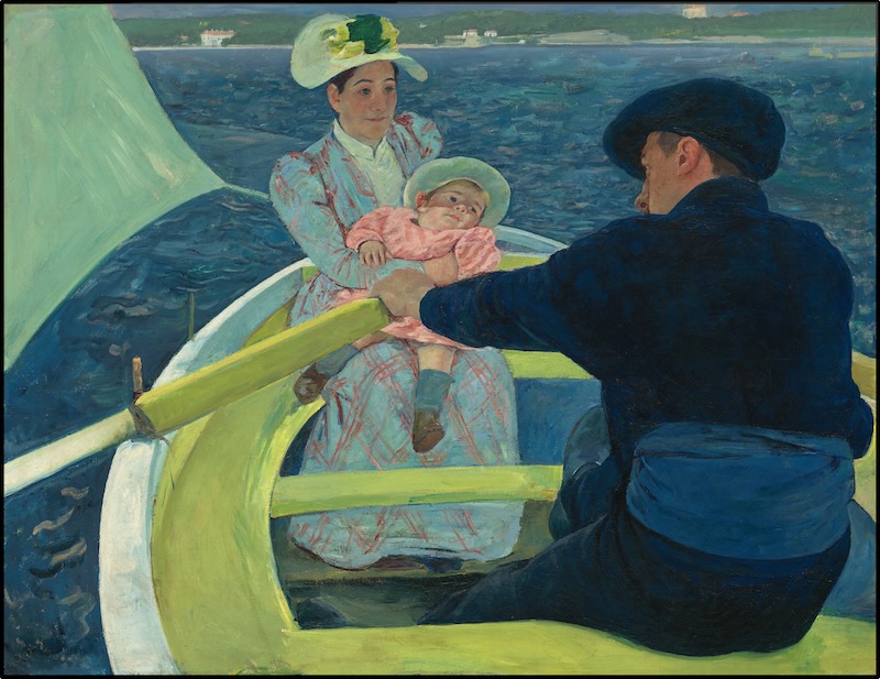
Now we can try making some changes. If we lighten the shoreline, it moves it back in space. It makes it feel much further in the background and it separates it from the woman and the other objects in the front of the painting. By doing that, I don’t have that same active space that’s calling my attention to the sides of the painting. I focus more on the woman and I don’t pay as much attention to the man and even to the sail. Certainly, I notice them. They don’t disappear. But I don’t engage with them as actively. I see them. I take them in. But my vision focuses more in one place on the woman. Pushing the shoreline back into the distance gives us more depth and thus more space in the painting. And this would tend to make me think that this should make the painting feel larger. But I end up feeling the opposite. It ends up feeling smaller to me. I think this is because the top shoreline becomes more disengaged. The woman moves forward and the shoreline, the very top of the painting, becomes less important. I focus on it less. My eye doesn’t engage with it as much. So I don’t spend as much time up there. And so the actual area of the painting that I actively take in decreases.
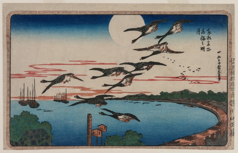
We can see a similar effect in Hiroshige’s print, “Full Moon Over Takanawa,” with Hiroshige’s Bokashi line appearing on both sides of the moon. We can see how we’re brought to see both sides of the picture on both the left and the right side of the moon.
However, if we limit the length of the top line on both sides and bring the line in towards the center, now our attention becomes more focused on the middle of the print, focused around the moon and the birds in the middle. Similarly, we can also move the focus from side to side.
If I extend the line all the way to the right side, then our attention naturally shifts there. I can also swap sides. I can move the line to the left side and then shift the focus to the left. It’s pretty amazing what we can do just playing around with this one line. However, let’s not fall into the trap of thinking that things are so simple or that things are so definite. It’s not as though our focus always follows that top line exactly. In fact, we can sometimes create the reverse effect.
By leaving a space on the top, we can also drive focus, just as we saw the idea of leaving a space as giving the work room to breathe. Leaving the space on top can sometimes allow room for the air and the energy to rise up and fill that space. We can follow that rising movement, feeling ourselves, feeling our intent, fill that space, and then look for that top line on the other side of the space. Of course, that movement occurs because of the presence of the top line on the other side.
It’s like a high pressure front pushing down the air on one side and the air of the low pressure front rising on the other side. I think that is, I think that’s maybe how those weather fronts work, I’m not really 100% sure. I’m far from being a meteorologist, but that feels about right.
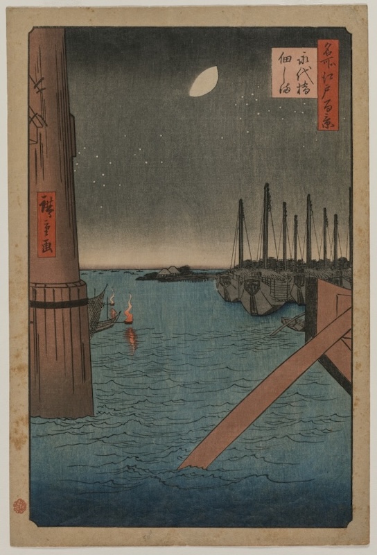
Speaking of weather, there can be a sense in which this line can contribute to a feeling of atmospheric perspective. The very darkest areas come forward, and then with the gradations of lighter areas, it seems to fall back into space. It can actually be a bit easier to see this effect done on the bottom of the print, as we see here in this print, Tsukudajima from Eitai Bridge. If we remove the graduated line on the bottom, we see that we feel the water is immediately at the front plane of the print, right at the front, but with the graduated line, it feels like it’s pushed back, as if there’s some more space between the front plane and the water.
This is a really interesting technique, especially if you’re a printmaker. I’m not really a printmaker, but I do find it very interesting in terms of how it affects pictorial space. Those of you who know me won’t be very surprised that I’m especially interested in how this affects pictorial space. By looking at this in terms of pictorial space and how it affects the space of the work, this lets us understand not just the particular print or how it was done. It lets us understand the space and how Hiroshige is using space in his works, but it also helps us to understand how other artists are using their space. Now, most other artists aren’t using this technique, but we can see how solid versus open spaces in a work will affect pictorial space, how it’ll move us around the space and perhaps direct us in terms of where the artist wants us to go or what we might feel.
Artwork:
Hiroshige, Pine of Success and Oumayagashi, Asakusa River (Asakusagawa Shubi no matsu Oumayagashi), from the series “One Hundred Famous Views of Edo (Meisho Edo hyakkei)”
https://www.artic.edu/artworks/34094/pine-of-success-and-oumayagashi-asakusa-river-asakusagawa-shubi-no-matsu-oumayagashi-from-the-series-one-hundred-famous-views-of-edo-meisho-edo-hyakkei
Hiroshige, The Fifty-Three Stations of the Tokaido: Otsu
https://www.clevelandart.org/art/1985.238
Kawashima Shigenobu, Pictures of Excursions Through the
Famous Sites of the Capital (Rakuyo
meisho kan’yu-e)
https://asia.si.edu/explore-art-culture/collections/search/edanmdm:fsg_F1975.27/
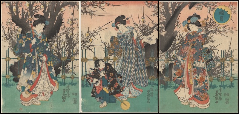
Utagawa Toyohiro, Old Cherry in Spring, Three Women and a Child with
Hobby Horse Walking Past, late 18th century – early 19th
century
https://artvee.com/dl/old-cherry-in-spring-three-women-and-a-child-with-hobby-horse-walking-past/
Suzuki Harunobu
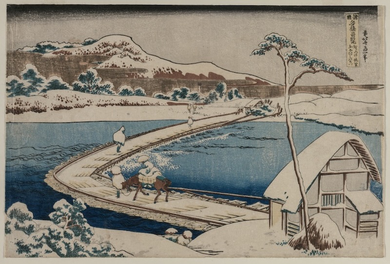
Katsushika Hokusai, An Ancient Picture of the Boat Bridge at Sano in Kozuke
https://www.clevelandart.org/art/1940.1001
Rembrandt van Rijn, Landscape with a Cottage and Hay Barn: Oblong, 1641.
https://www.clevelandart.org/art/1968.37
James McNeil Whistler, St. James St., 1878
https://www.metmuseum.org/art/collection/search/372554
Claude Monet, Low Tide at Pourville, near Dieppe, 1882
https://www.clevelandart.org/art/1947.196
Thomas Cole, View of Florence, 1837
https://www.clevelandart.org/art/1961.39
Nukina Kayoku, Lake Biwa in Four Seasons, 1834
https://www.metmuseum.org/art/collection/search/640049
George Inness, Montclair
https://www.clevelandart.org/art/1955.670
Hiroshige, Full Moon Over Takanawa, c. 1831. Courtesy of The Cleveland Museum of Art
https://www.clevelandart.org/art/1930.187
Utagawa Hiroshige, Tsukudajima from Eitai Bridge, from the series One Hundred Views of Famous Places in Edo, 1858. Courtesy of The Cleveland Museum of Art
https://www.clevelandart.org/print/art/1992.73