Previously, we talked about Bruegel’s painting, The Harvesters, and we talked about how he’s shifting where we stand in that painting. First, we stand on one side and we look at the painting from one direction, and then we move over here. We look at the painting from here. Then we shift over here. We look at the painting from this way. And in this way, he creates a great sense of grandeur. I likened it to a reverse panorama. In a panorama, we stand in one place, we take the camera and we shift it around. Conversely, in this case, we are the ones moving around. So by doing that, he creates space. He lets us look around and feel the space, and move through the space in a very special way.
In this post we’re also going to look at a couple of other paintings by Bruegel in which he also shifts space and plays with space in interesting ways. Along the way, we will also talk about complementary colors and some problems with how they are described in conventional color theory.
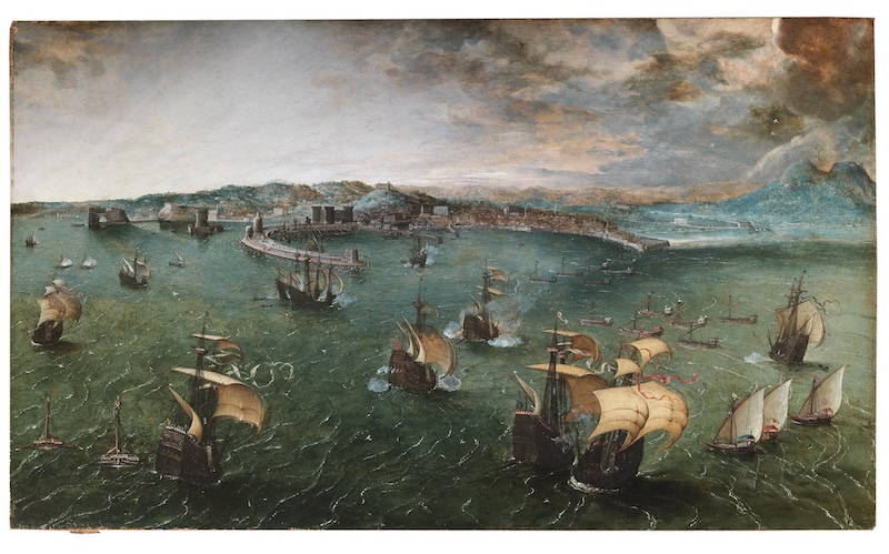
In Bruegel’s painting, a Battle in the Bay of Naples, the sense of space is quite a bit larger than what we might expect in a conventional, linear perspective use of space. And I think this was on purpose to give us this sense of grandeur, this sense of large space and the depiction of the space and the breadth of the battle.
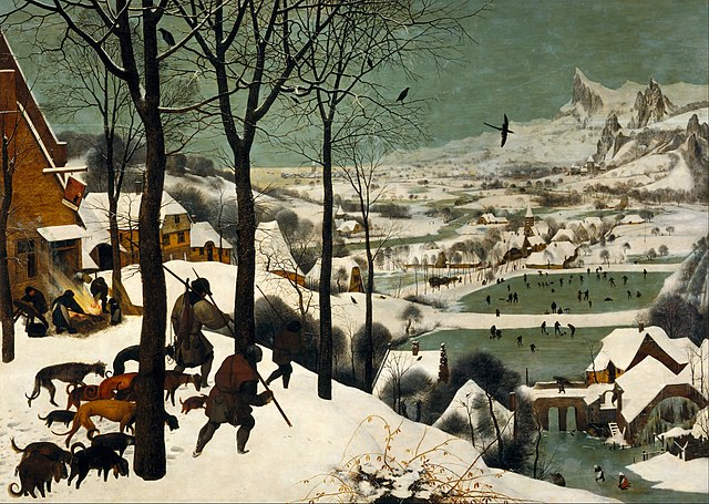
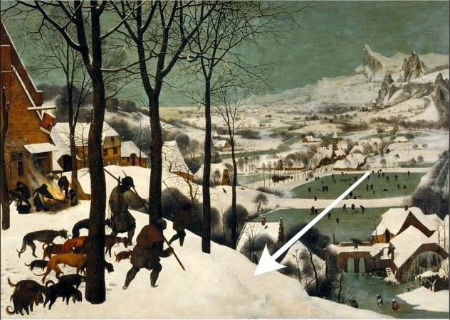
We also see it, although a little bit differently in the painting, Hunters in the Snow by Bruegel. Hunters in the Snow, is interesting in that there are two spaces. There’s a space in the foreground and there’s a space in the background. And they’re really kind of separate. We can see one, and we can look and we can see the other. But Bruegel does something that I really think is quite interesting. He finds a way to join them so we don’t feel disjointed. It doesn’t feel like, foreground space, background space. It feels very continuous.
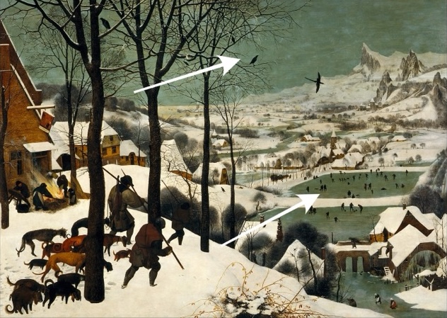
Let’s take a couple of the birds out and see how that changes the feeling of the space. It makes it start to feel a little more disjointed, a little bit more foreground, background.
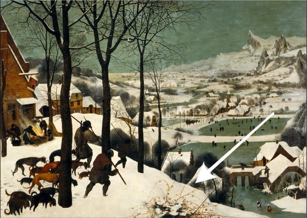
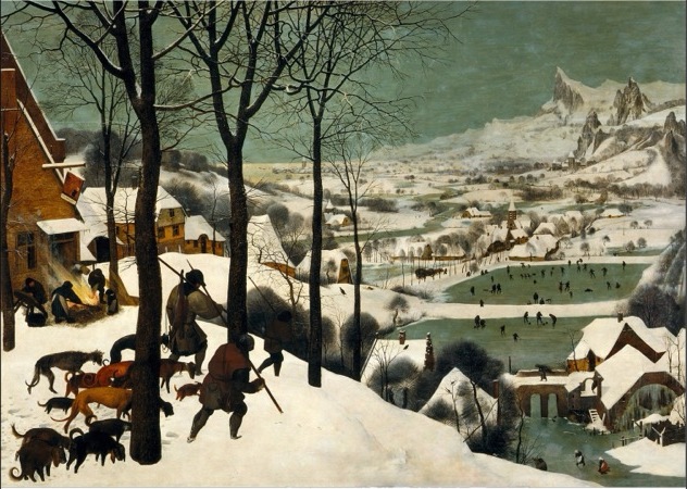

Let’s go a step further. There’s a little bush. Let’s take the bush out first. And we can see that if we remove that bush, we still have the little demarcation of the hill. So let’s go a step further and let’s take the hill out. Now we really have separated further the foreground space and the background space or the space on top of the hill and the space back and on the bottom of the hill, all the people, they’re ice skating and they’re playing in the ice and the snow. If we bring back these elements, the birds and the hill, we can see how things start to connect again.
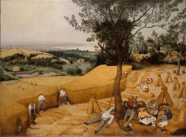

With The harvesters, we talked about how Bruegel uses color to separate the two spaces. We have the reddish yellow and we have the greenish blue. And we talked about how those two colors are Separating, how they separate from each other. And if we change that green to a more of a yellowish green, they start to join together a little more.

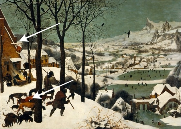
If we look at this painting, the Hunters in the Snow, we can see that Bruegel has again used a very simple color scheme. There’s not a lot of colors in this painting. We have a yellowish red and then we have two greens. We have bluish green and yellowish green. And by using these two greens, he’s playing with the space. We’ve got a red and a green that join together and a red and green that don’t join as much and are not quite as harmonious.
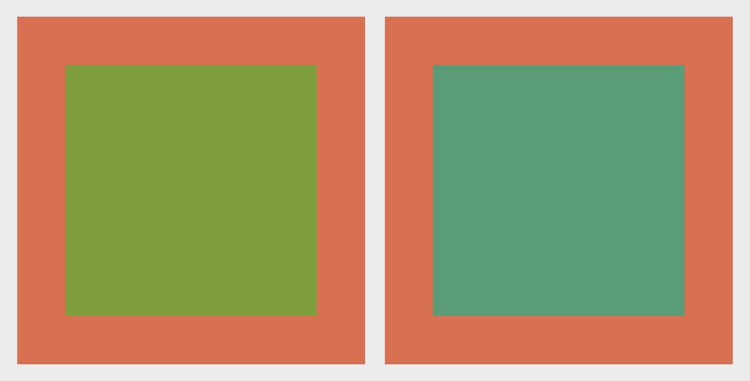
And we can see examples of these colors here. We can look at it independently. We can see an example of this yellowish red with this yellowish green. We can see how they sit very nicely together. If we take the bluish green with that yellowish red, we can see how they don’t sit together as well.
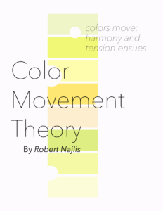
This is perhaps a little strange the way I’m talking about these colors, because we usually hear that red and green are complements. Red and green are complements. That’s it. So they go together. I tend to not fully agree with our conventional view of complementary colors and a number of issues in color theory. That might be why I wrote my own book on color called Color Movement Theory. But I’m not the only one who has some concerns about color and color theory. In fact, if we look at Joseph Albers, he says that complementary colors are topographically vague. What does that mean? They’re topographically vague. It means that the relationship around the color wheel isn’t clear. Partially it depends on what color wheel we’re using. And also, it’s not enough to just say these two colors are complementary colors. There’s more going on. Red and green. Well, that’s a large swath of colors. We need to be more particular about what kind of red, what kind of green. And it’s going to be different for each of us as well. We all see colors differently.
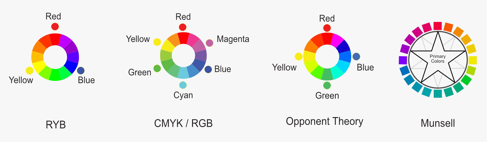
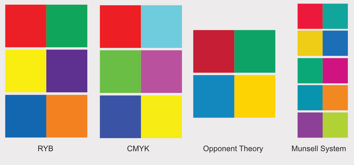
We need something that’s a little bit more clear. I find that conventional color theory tends to have two large problems. One, it tends to be very rigid. And two, it tends to be a bit vague, like this. Red and green. It’s not very clear. And it’s also rather rigid. These are the complementary colors. Those are not. Well, for this color wheel these may be complementary colors, but for another color wheel, we might find different complementary color pairs. For example, the traditional color wheel is red, yellow, and blue as the three primary colors. Nowadays, people like to talk about CMYK, cyan, magenta, yellow, as the primary colors. Or what about red, green, and blue? There is also Opponent Theory pairs of red and green and blue and yellow. In addition, there is Munsell’s color wheel, in which we find five primary colors! Each of these different color wheels, present us with different sets of complementary colors, and different sets of relationships. Thus it is somewhat rigid and arbitrary to dictate a fixed set of complementary colors based on one color wheel choice.
As Albers says, it is also a bit vague, not quite clear. Red and green. Blue and orange. Well, what kind of blue? What kind of orange? What kind of red? What kind of green? What are the relationships that they’re defining? How are they talking to each other? How are they moving towards or away from each other? We need to become sensitive to this. We need to become aware of it. We need to be able to feel it and understand the language of colors. What are these colors saying to each other? How are they communicating to each other? In my view, colors speak through movement. That’s why my book is called Color Movement Theory. And it’s these movements towards or away that create harmony and tension that speak, that give rise to these feelings and emotions that we talk and we feel so greatly through color.
In Bruegel, we can see how he’s playing with, he’s bringing two kinds of green. It’s different than in the Harvesters where it was one yellow and one green, a specific relationship. And this one, there’s a bit of a push and pull, a bit of a play with this sense of space, this sense of connection and relationship between the red and the two different kinds of greens. Because again, as we look at this painting, there’s not a lot of colors. And yet, there’s a great amount of feeling, there’s a great amount of movement. It’s brilliant painting. So we really need to think about how he’s able to do that. What are the color relationships, what are the spatial relationships that allow him to create this sense of feeling?
I did mention my book, Color Movement Theory, a little bit. Please do take a look at it. I hope you’ll find it interesting and useful. I’ve had a number of students who have read through the book and really used it very thoroughly. And their progress, their understanding of color has really changed enormously. Their growth, their ability to use color how they want. The book is not about this is the way you should use color. It’s not that kind of book. The book is about understanding the language of color, finding a very simple language to understand it. The language is not complicated. What’s hard, what takes time is developing our ability to feel that, our sensitivity, our sensitivity to what the colors are saying, how they’re speaking to each other, and then seeing how we can use that and how we want to use that in our own work. And I think the book is applicable to artists as well as non-artists. I’ve had a number of people who are art lovers but not artists in themselves have bought the book, have read it, and it’s really helped them to understand the paintings that they’re looking at, how different artists are using color, and how those colors are speaking to us. So I think it’s a book that can be applicable to everybody, anybody who’s interested in color at least.
Artwork:
Pieter Bruegel the Elder, Hunters in the Snow
https://www.khm.at/kunstwerke/jaeger-im-schnee-winter-327
Pieter Bruegel, A Battle in the Bay of Naples
https://www.doriapamphilj.it/en/portfolio/pieter-bruegel-the-elder/