The Birthday
1915
Previously, we looked at paintings where the artist had tipped up space. We saw some paintings where the floor, instead of looking very flat, as we might want the floor to be, the floor was quite a bit tipped up.
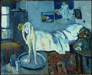
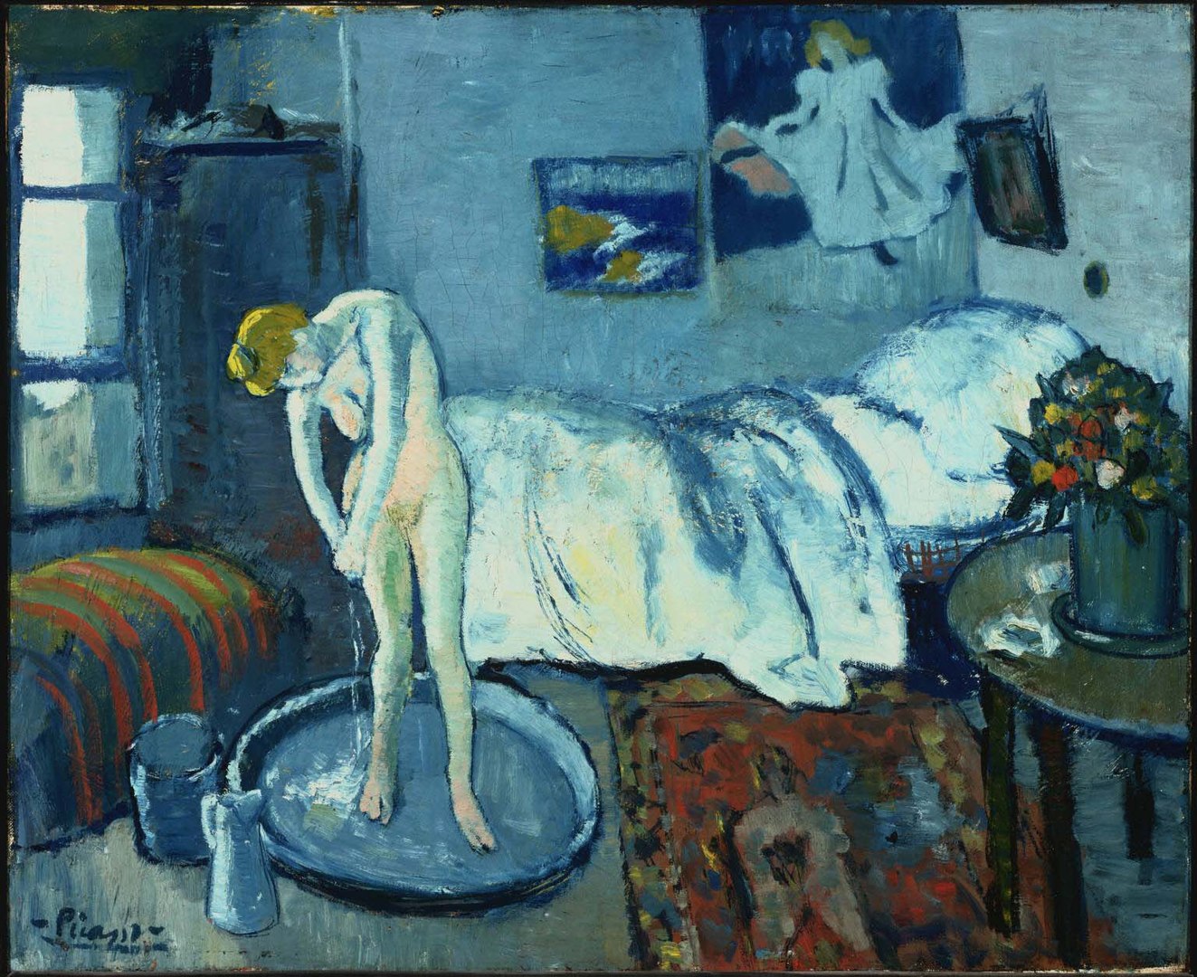
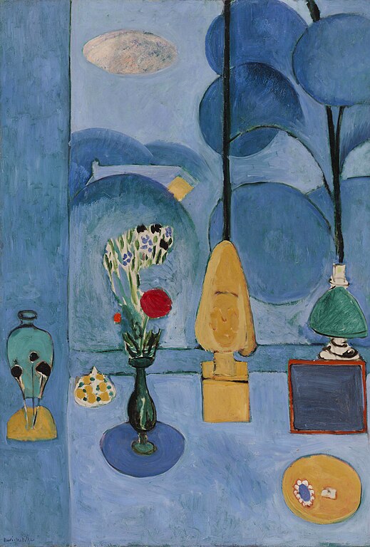
We saw this, for example, in Picasso’s painting The Blue Room. We saw some paintings by Matisse that did it this way. We also saw some Middle Eastern paintings that had done this, some Chinese paintings that had done this.
We also saw some paintings that kind of had a mixture. Some tipping up, some more what we would consider typical linear perspective space. So we saw paintings where the space was fully tipped up, and some paintings where part of the space was tipped up and part of it wasn’t.
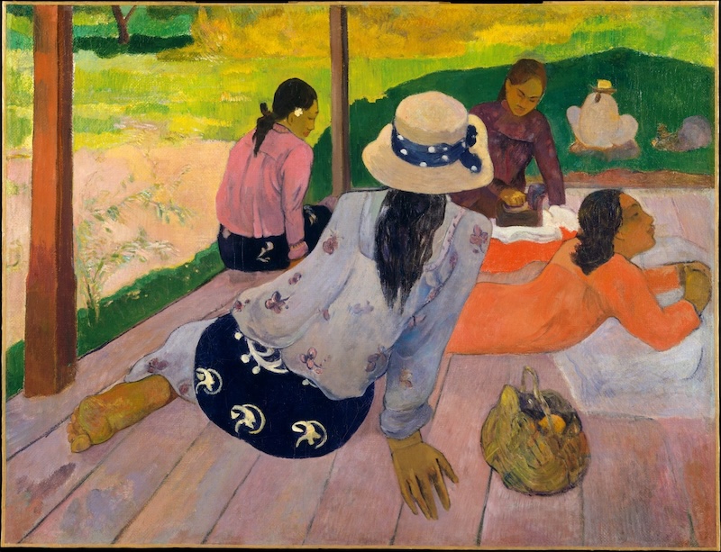
Today, I want to look at another example. It’s a painting called The Siesta by Gauguin. It’s a pretty subtle example, actually. In this painting by Gauguin, The Siesta, at first it can look like a pretty conventional example of linear perspective.
But if we look very closely at the floor they’re sitting on, we can see that the perspective shifts slightly. I think this is done in order to create more space for the woman in the back.
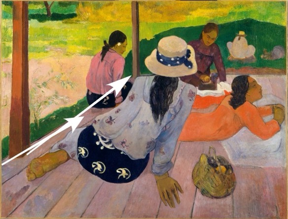
If we followed a true linear perspective, I think that the woman in back would get blocked by the woman in front, and they’d be hard to see. This would be especially problematic, as we see the back of the woman in front, and she is looking towards the woman in the back of the painting. There’s a bit of a feeling of two perspectives combined. One of us is looking at the back of the woman in front, while the other is her looking at the woman in the painting. We can see that the floor they’re lying on first starts to angle downwards, and then when it hits a certain point, it starts to angle slightly upwards. So again, this creates a situation where the space in the front, where the first woman is sitting, starts to get a little smaller as it moves back. But then the second space, as it goes further back in space, actually starts to get slightly larger and move upwards in the space of the canvas. This allows us to see those women behind her. This is a subtle example. It’s a little different than what we saw with tipping up, in that it’s not that the whole painting is tipped up. In fact, very little of it is tipped up. What’s interesting is that there’s a slight curve to the shape of the floor, the space where all the women are sitting.
It moves in at a certain angle, and then it slightly tilts up. And it tilts up so we can see the women in the back. There’s a woman in front, and then there’s some women behind her. And if the floor weren’t tipped up in this way, we wouldn’t be able to see the woman behind her very well.
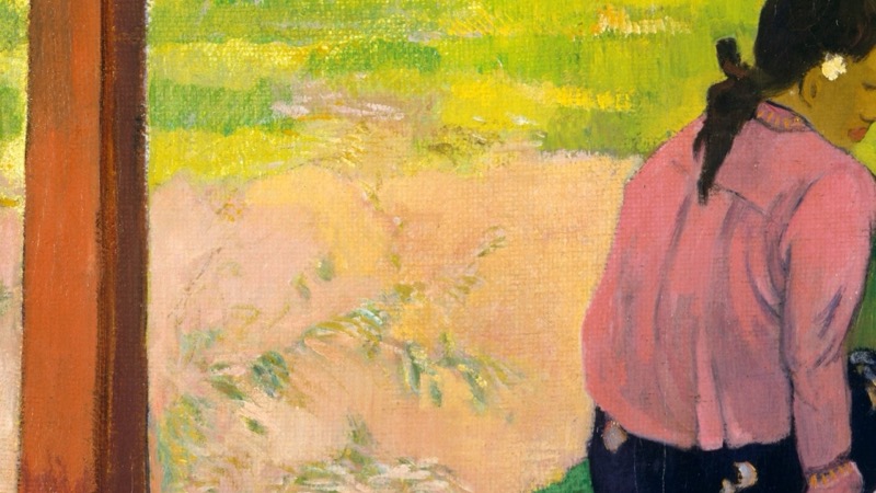
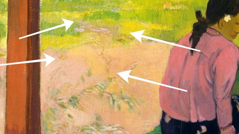
It may be the case that that woman on the left, the woman behind the front woman, may have been further to the side originally. In fact, if we look very closely, we can see indications of a woman painted in the greenery, or rather, perhaps the remnants of what was the painting of a woman in what then became greenery. So it’s quite possible that Gauguin moved the location of the woman from that left side over to where she is now. And in moving her over, in order to allow us to see her, he would then have to shift slightly the floor to lift up her position. Otherwise, she’d be too low, and she would be really lost behind that woman in front.
The space in this painting is really quite interesting, but the colors are really quite marvelous. In fact, as we first see them, we can see this wonderful rhythm in the colors. We move to the space rather quickly in this rhythmic motion from one woman to the next, and then into the background, the space around them. Gauguin does this marvelously by controlling the relationship of the colors to each other.
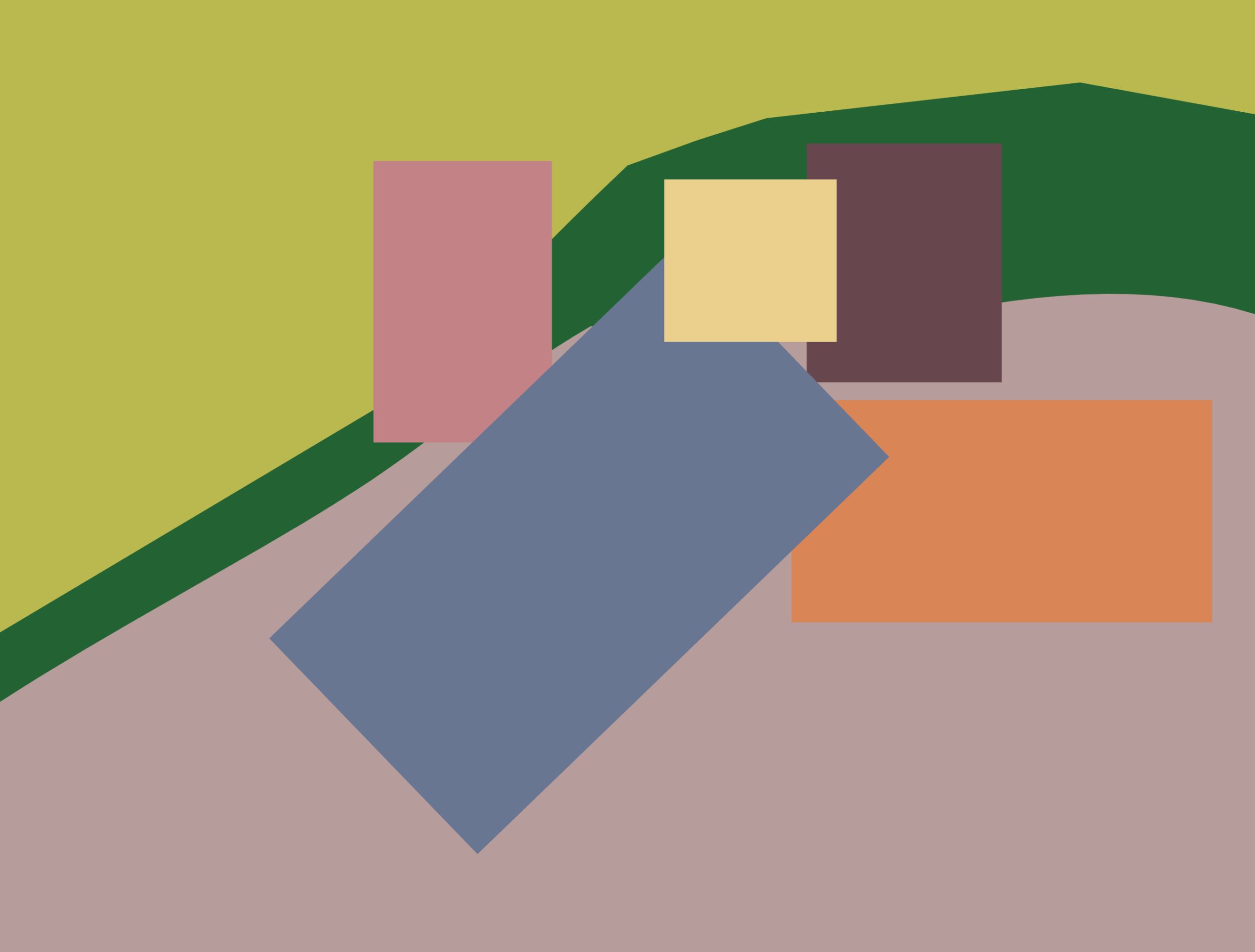
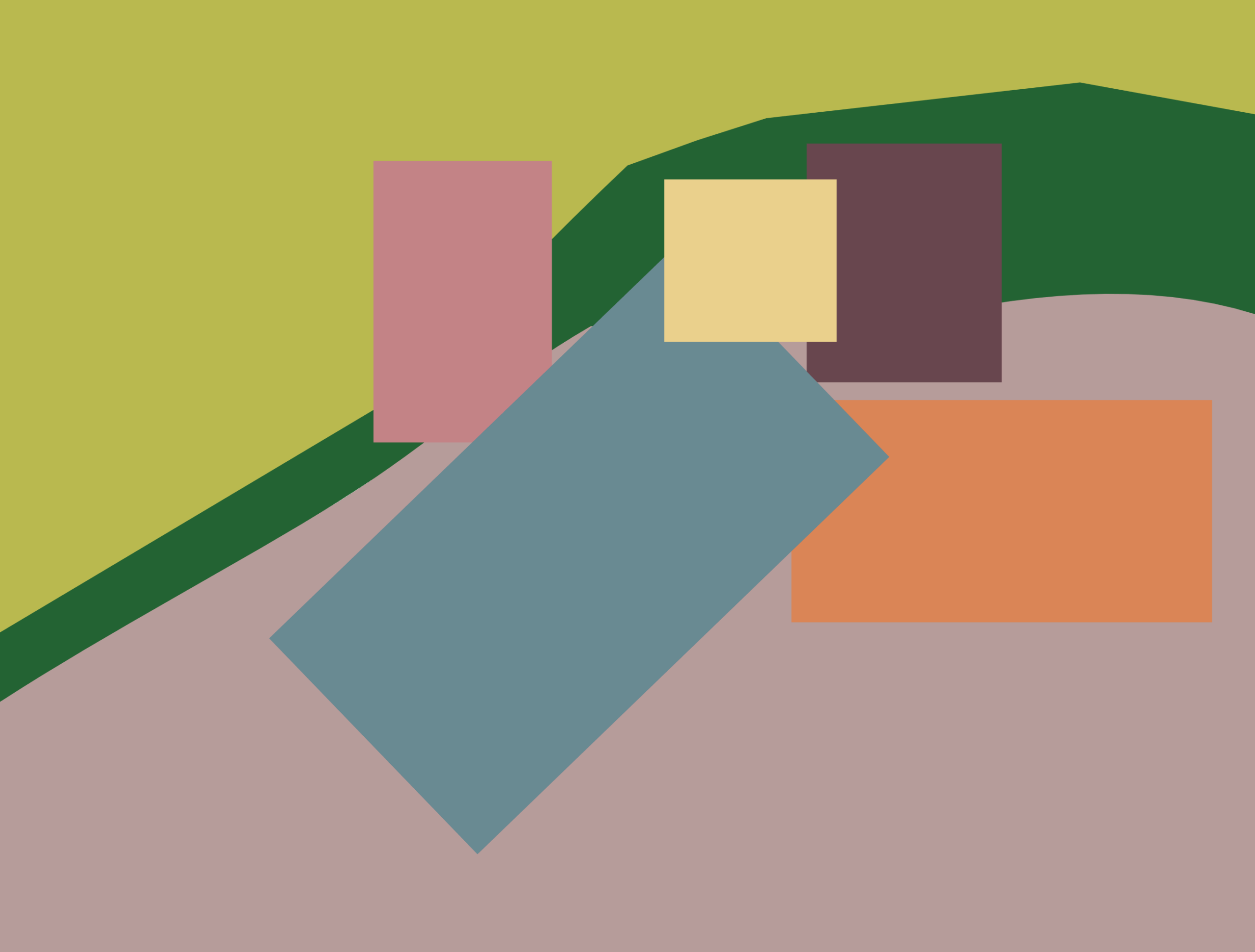
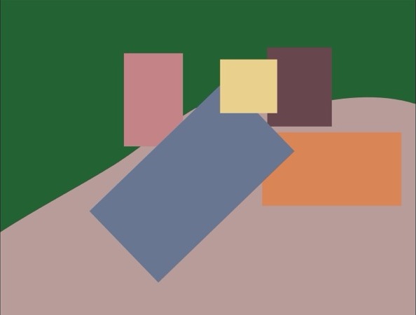
In order to take a look at this, let’s create a simple planal map that will show us the basic spaces and the basic colors that are being used in this painting. Now, there’s a lot of details that I’m not capturing in this planal map, but that’s part of the point of it. I want this to be a simple way to study the painting and understand what’s going on.
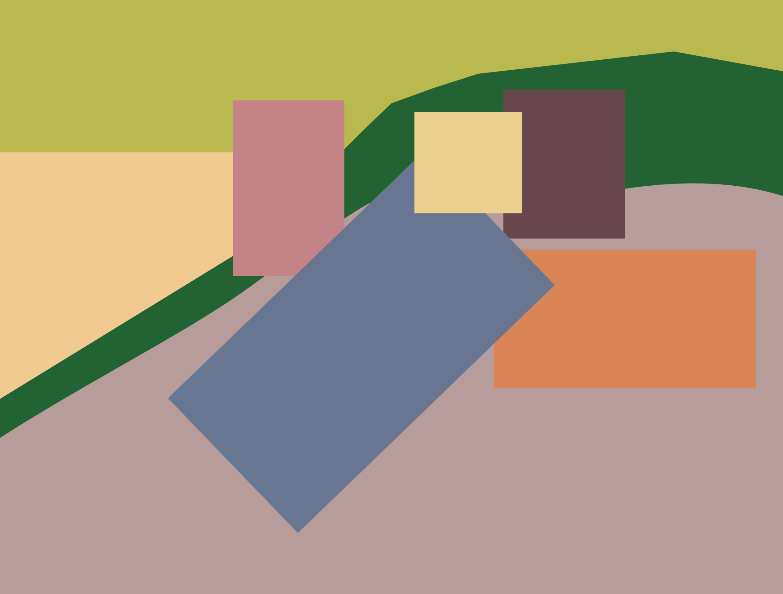
We can certainly add more details as well, such as the space on the side here, which is, a little bit of a garden, and we can look at the general color, which is sort of a reddish-yellow, and we can imagine also what would happen if we change that color to something else, like a greenish-blue.

Let’s take a general look at the colors, moving away from the planal map and putting the colors together. We can see that taking the colors from the clothing of the women and the floor that they’re sitting on, there is somewhat of a rhythm, somewhat of a movement. They don’t all just hold together very easily. They look fine, but there’s some colors that are moving together and some colors that are moving apart, a little bit of a rhythmic movement.


If we now take this reddish-blue from the clothing that the woman in front is wearing, we can see that this reddish-blue sitting on top of all those other colors makes them all hold together. They all have a certain relationship with that reddish-blue that brings them all together.


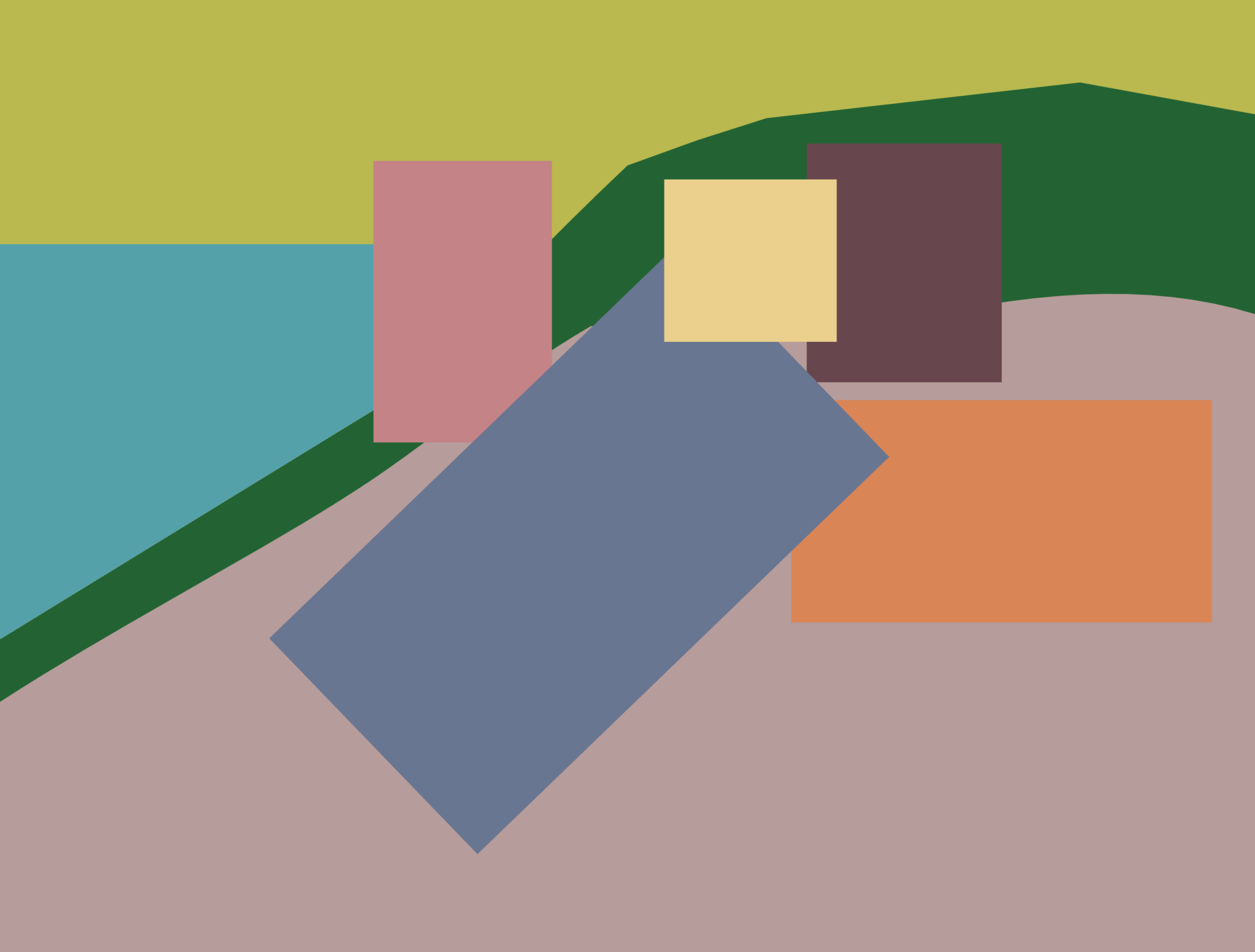
If we were to change that reddish-blue to, a greenish-blue, we would see that the relationship would be very different. We can see if we put that greenish-blue on top of these other color squares, it really doesn’t hold together in the same way.
If we go back to the planal map and we put that greenish-blue in place of the reddish-blue, we can see that the color relationships, they don’t hold together in the same way. They don’t make sense. There’s not the same sense of harmony. Even though there’s movement to and fro with the reddish-blue, there’s a sense of harmony, a sense of them holding together. When we put that greenish-blue there instead, things really kind of fall apart. There’s nothing holding them together.
This is a fascinating aspect of color movement. You can see that in this video, we’re talking about this in a somewhat general way. I’m talking about colors going together, a bit of harmony, maybe talking a little bit about tension, but I’m not being very specific about color movement. The reason is that in order to be very specific about color movement, we need to understand the language of colors. We need to understand how they move and how they relate to each other. And this is something that I go into detail in my book, Color Movement Theory. The fact is that the language of color, the way they talk to each other, it’s really not that complicated. It’s not a huge language. It’s rather simple, but it does take some time to understand it, to become sensitive to it, to understand and be aware of how they’re moving, how they’re talking to each other. And for that reason, I’m keeping the discussion here a little bit more general and something that we can understand quickly and easily. After reading my book, then we develop a language for it. We develop the ability to talk about it more in depth and more in detail.
The reason I developed a language for talking about color movement is that the current language that we have, things like hue, value, saturation, even color temperatures, color schemes, complementary colors, they don’t speak of this. They don’t talk about directionality of movement, how colors are moving, how they’re moving in relationship to each other. We don’t have a language for it. We see that language in music theory, for example. In music theory, there’s a very clear language about how sounds, how notes, how chords are moving in relationship to each other. Now, there’s certainly room within music theory for disagreement and we’ll find it, we’ll find differing opinions. That’s a great thing. But at least there’s a language from which they can begin that discussion. And so with color movement theory, one of my goals is to develop that language so we have the ability to talk about the colors, the way they move, the directionality of movement, their relationships, if they’re harmonious, if it’s tense, how they’re moving and how we can work with that, how we can understand it and use it with our own artwork as well.
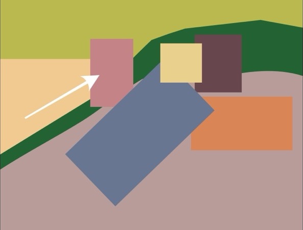
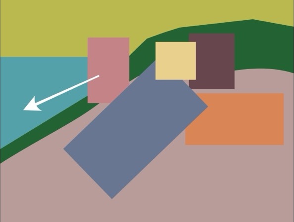
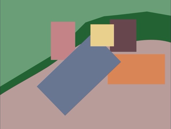
For example, if we add this left section from the painting into the planal map, which is the garden in the painting, if we add it as fairly close to what it is in the original painting, we see that it’s basically a reddish yellow. There’s some other colors in there as well, but we’ll simplify it to a reddish yellow. We can see that with this reddish yellow, the space acts almost like an arrow pointing us towards that woman in the left. However, if we then change that color to a greenish blue, the arrow, the directionality changes. Instead of pushing us towards that woman, it now moves away from that woman.
With a simple change of color, we can change the directionality of movement. We can change the space of the painting. We can change, you can call it composition, you can call it pictorial space, but we can change how we’re moving through the painting, how we’re feeling it, how we understand it. And again, going back to color movement theory, for me, the book is useful for artists as well as non-artists because we can use it to create our own artwork, but we can also use this idea to understand better what we’re seeing. The more we’re able to understand the language of the art, the better we’re able to understand what it’s saying and understand its conversation that it’s trying to have with us.
I mentioned that the woman on the left apparently was further over to the left and we can see traces of that. It assumes that there may have been one other change as well, at least that I’m aware of, which is that the basket may originally have been a dog. I don’t know if this changes much compositionally, spatially, or color-wise, but it is interesting. And I do think that if that basket were a dog, it would probably grab our attention much more.
We can see that in this painting, Gauguin is using both space, tipping it up very slightly or shifting it very slightly, as well as color to create this rhythmic movement to move us through the painting. We can also look at some more aspects of the color.

For example, look at the background and notice you have a bluish green and a yellowish green. If we change the background to be, let’s say, all bluish green, whether all the same bluish green, or perhaps a slightly lighter bluer green, the yellowish green is a lighter color, so we might want to match that idea a little bit. Either way, we don’t see that same sense of movement, whereas having the yellowish green and the bluish green, not only do those two greens interact with each other, but they interact with the clothing that the women are wearing, and it helps to create this rhythmic movement.
This is a very interesting painting. There’s a lot happening with it, both spatially and color-wise. For me, color is an aspect of space. Color affects pictorial space and how we move through the space, how we interact with the space, so I kind of think of pictorial space and color being an aspect of that.
Artwork:
Paul Gaugin, The Siesta
https://www.metmuseum.org/art/collection/search/436449