How do we go about studying pictorial space?
There’s space in an artwork. There’s space left to right, up and down, back and forwards, in any kind of two-dimensional artwork. There’s lots of rules and schemes that try and tell us what maybe we should do. The rule of thirds, the golden ratio, maybe a circular composition, or triangular composition, or put an S shape in your work. But I want a way that I can ask questions, that I can use to study other artwork, so that I can understand what’s been done, and what I might want to do. I can apply lessons and things that I’ve learned from other artwork.
A lot of artwork doesn’t follow these rules that we’re taught. We’re told rule of thirds, or this composition scheme, or that composition scheme, and we see all this artwork that doesn’t follow those rules, but they’re still brilliant. They still work really well.
For this reason, I like to create something that I call planal maps. Planal maps are a simple and flexible way to study pictorial space using shapes and planes.
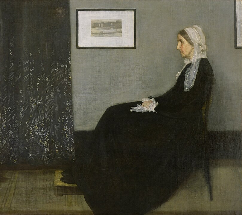
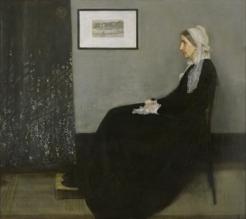
We can take any kind of artwork that we see, and on top of it, we can overlay different shapes, different planes, to study how that work is functioning. Here we’re going to look at the painting, Whistler’s Mother by James McNeil Whistler. We’re going to use some very simple planal maps to understand a little bit about how he used space, and maybe ask a couple of questions just to get a sense of how we can apply planal maps to this painting, and how they might be useful.
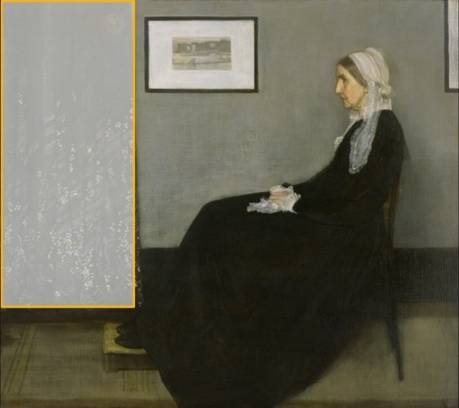
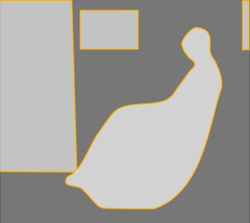
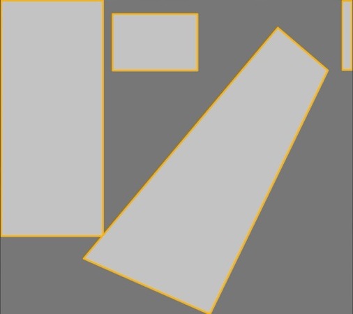
Let’s take a look at some of the main features in this painting, and apply some simple planal shapes to them. On the left side of the painting, we have a large kimono. We’ll begin by describing this with a large rectangular shape. Actually, originally, I thought this was a curtain, but it turns out that it’s a kimono. Either way, we’re going to start by describing it with a large rectangular shape.
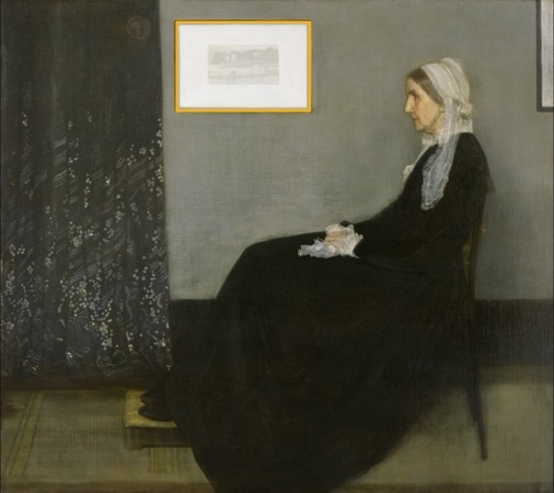
Then, we have a print in the frame on the wall, which we’ll also use a small rectangle for. We could describe both the shape of the print inside the frame, as well as the outer frame, but let’s just start with a whole frame for now.
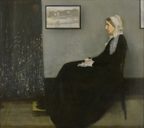
But I’ll leave it with you to notice how Whistler has left a large white space between the print and the frame. If he hadn’t done this, it would actually affect the composition.
Moving on, we have the edge of a picture frame here at the very edge of the painting. Just the smallest bit of the frame poking out at the edge of the painting. Kind of a curious feature that we’ll discuss a little bit more later.
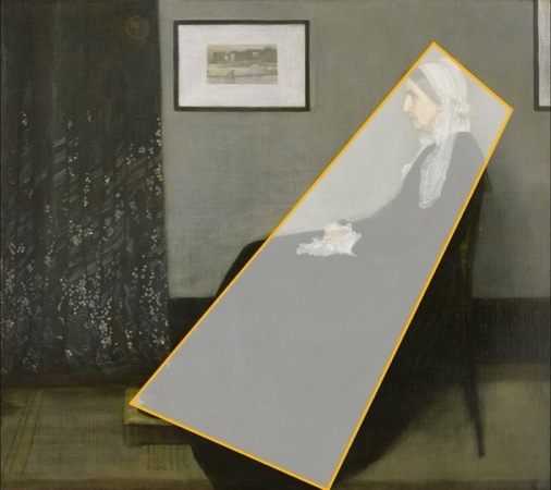
Of course, the main feature of the painting is the mother. We’ll start with a simple semi-rectangular shape for her, though we can also use other shapes as well.
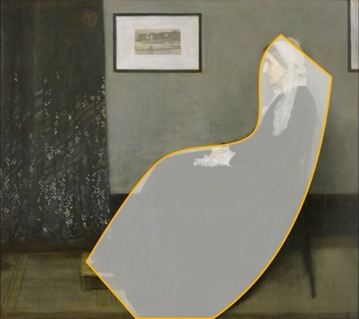
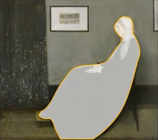
Here we can see shapes that are progressively more resemblant of the actual shape of the mother.
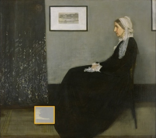
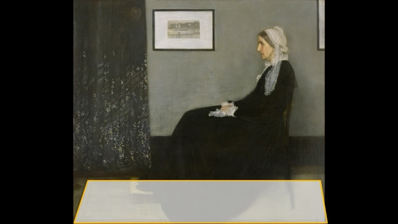
We can also see the footrest that she’s resting her feet on, and of course, the rug on the floor.
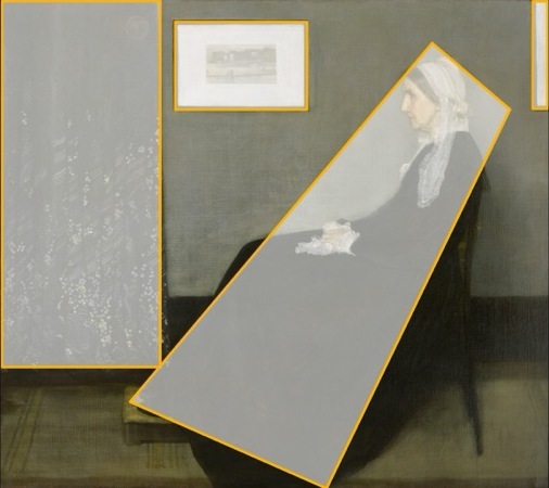
As you’ve seen, we’re using simple shapes to represent these objects that appear in the painting. Of course, this begs the question of why do this? Why would we want to create these simple shapes and overlay them on top of a beautiful painting? After all, wouldn’t we rather see the painting? Well, yes, we would rather see the painting in order to enjoy it. But we’re using these planal maps as a tool to help us see, analyze, and understand the elements of the painting better, how they fit together, how they interact, and how they relate to the overall pictorial space of the work. And by using this technique, we can also ask questions and try changing things to get a different view of the space, to better understand how the space works, and get ideas for different things that we might want to do, as well as better understanding why the artist chose this particular way of doing things.
We are applying this technique to Whistler’s mother. This will give us a good example of how and why to use planal maps, as well as an opportunity to learn a little bit about some of the things happening in this wonderful painting. There’s a lot going on in this work, so we won’t cover it all right now, but we can get a good look at a few aspects of it and ask a few questions as well. We can already ask some questions, though.
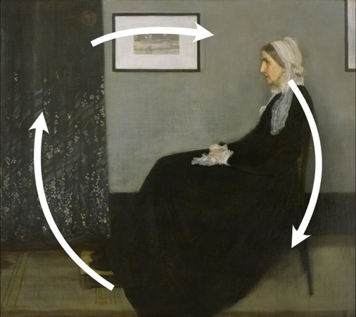
For example, what if we turn the mother around so she’s facing the other way? If we do that, for one thing, we no longer have a circular composition.
In the original painting, there’s a circular movement with the mother, the kimono, and the print on the wall behind her.
But perhaps we now have a triangular one? More importantly, we have the opportunity to ask if we like the current composition and also test out a new one. And if we were to change it, what else might we want to change?
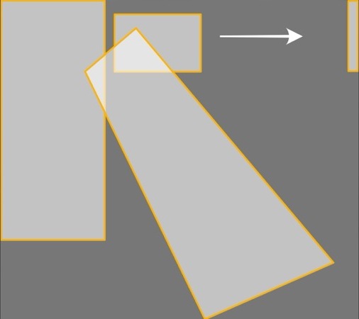
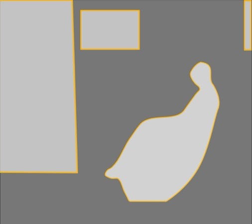
For instance, if we stick with this idea of having the mother face the other direction, then we might want to move the print over to give us some more space and prevent things from getting too crowded with the mother and the kimono and the print all in the same corner.
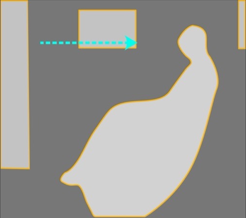
Maybe we don’t need that print on the edge of the space. What do you think? What’s the purpose of the frame at the edge of the painting? Is it influencing the circular motion of the composition? It seems a bit strange on the surface. Why would there be just a tiny bit of the picture frame in view?
If I remove the frame from the image, we can see that it has an important influence. Without the frame, I can easily exit the painting. I move off to the right and I just keep moving and moving and moving and I don’t stop.
There’s nothing there to stop me or prevent me from keeping on moving further and further to the right and eventually exiting the painting.
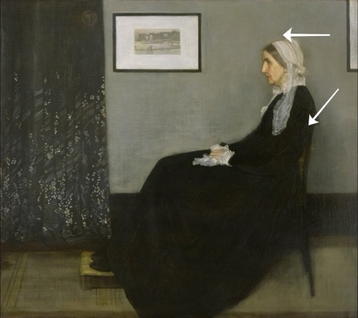
The frame exerts a visual pressure which pushes my eye back into the picture. It keeps me from exiting the picture and it pushes me back towards the main elements of the painting. This little tiny bit of a picture frame actually has a very important influence on the overall composition of the work. If we remove it but move the other print over, will we still exit the painting or will the changes that we made keep us in the space?


Now that we’ve gotten started with some basic planal shapes, we can start to add a few more details. Let’s start with perhaps the most obvious thing. Let’s make the shape of the mother more curved and closer to the actual shape of the painting. This will allow us to compare the impact of straight versus curved lines in the painting. We could very closely follow the shape of the mother if we wanted, but let’s leave it a little bit more abstract as it is, at least for now. We can see the drastic difference in the effect of the curved lines. For one thing, we now move through the space slower. With the straight line version, we really speed through the space. The sense of movement is fast and mechanical. On the other hand, when the lines are curved, we take a longer, slower journey through the space. The feeling is also softer and more organic.
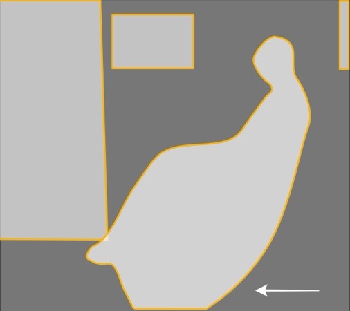
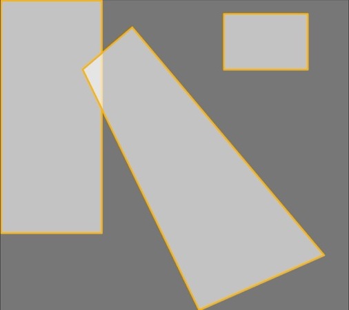
We’ve been using a straight rectangle to describe the kimono. However, the way the kimono is hanging, there’s actually a slight bit of an angle to the shape. When we adjust the plane to show that angle of the kimono, it once again changes the feeling and speed with which we move through the space.
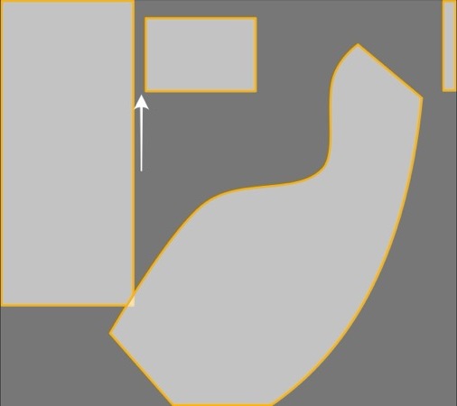
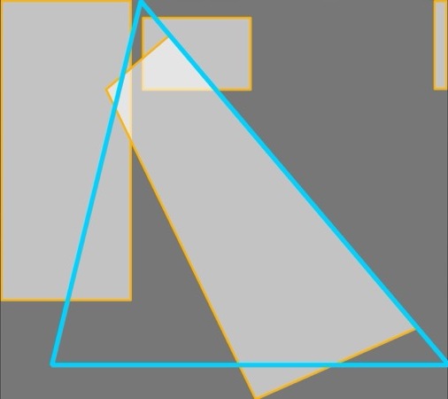
With a straight rectangle, the kimono moves up the side of the painting, passing by the print on the wall with barely an acknowledgement.
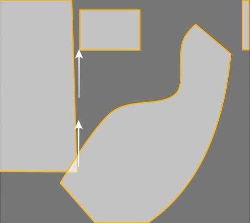
Now that the kimono is angled, there’s a bit of discomfort, even a possibility that they might run into each other. In fact, we can see that if we follow the widest part of the kimono straight upwards, it would, in fact, overlap the print slightly.
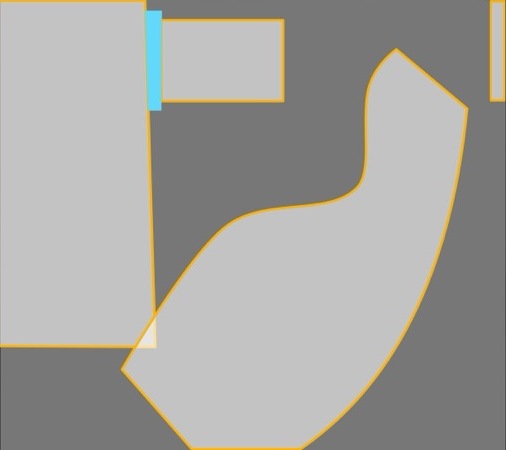
Thus, we can feel the kimono making way for the print just a little bit, and so we’ve created a bit of tension and a conversation between the kimono and the print on the wall.
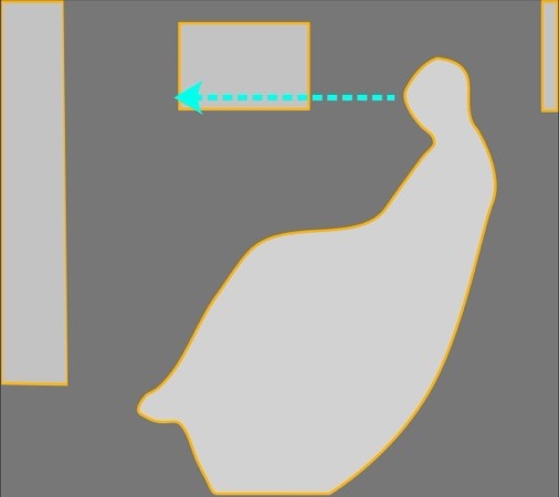
We can also change the position of the kimono so that it doesn’t enter the room as much. Now the kimono doesn’t enter the room nearly as much, and the conversation is curtailed. In the original painting, the bottom edge of the kimono and the mother’s dress overlap slightly. Now with this change, she no longer touches the kimono as she originally did. With this change, it’s much harder for her gaze to reach the kimono and for the kimono to reply. For the kimono does reply.
In the painting, after all, we’re not really talking about people and kimonos. We’re talking about shapes and colors and the conversations that they create between them. Now we can go a bit further, looking at some more details and asking further questions.
Let’s try making the mother smaller and see what happens. When we make her smaller like this, it puts her in the space, and it actually diminishes her. Whereas originally she dominated the space, now she feels dominated by the space. In the original painting, she defines the space and the relationships, but now they define her. So not only have we changed the size or position of something in the painting, we change their whole conversation.
Let’s make a similar but slightly more subtle change. Let’s raise the placement of the mother’s dress so that it doesn’t reach the bottom of the picture frame. The dress has quite a bit of size and movement to it. We can easily make it smaller without changing the size or scale of the mother as a whole. With this one change, we have once again had a dramatic effect. Once again, this reduces her gravity and overall importance in the scope of the world of the painting. This is because the dress is now encapsulated inside the painting.
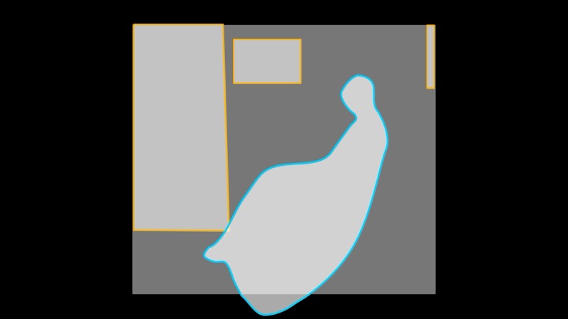
When the dress touches the edge, it gives us the idea that, well, it could continue, and it can continue beyond the edge of the painting. And the fact is, we don’t know how big it is or how far it will continue. By putting the dress inside of the frame of the painting, we now know how big it is. We know where it stops. It has a limit, whereas before, it was potentially limitless.
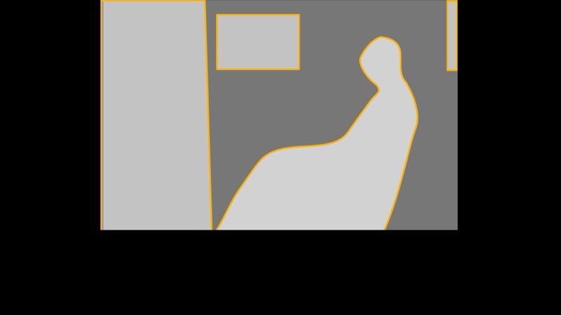
While we’re here looking at the bottom of the painting, let’s ask a common and an important question. Where should we crop the painting? Should we crop it higher than it currently is? When we do crop out the bottom of the painting, the change in the feeling is palpable. In the cropped version, the focus is on Whistler’s mother looking at the kimono. However, that conversation seems much more muted, much less rich, as we’re now missing the complex world that exists towards the bottom of the painting. With the baseboard of the wall, the footrest, the floor, and the grand sweep of the dress, the original version is much fuller. She’s large and grounded. She, the mother, is the key part of the world which supports and nurtures us. The space and elements at the bottom of the painting add weight to the work. These elements help to bring the eye down to that part of the painting, instead of keeping it focused only on the upper section. Thus creating that circular movement that we discussed earlier.
As we delve into a painting like this, there are never-ending possibilities. But I think we’ve had some nice opportunity to play with some different shapes, try a few different compositional ideas, and importantly, see how we can use this idea of planal maps to play around, to try different things, to ask questions. I think this is really important with planal maps. The idea is not to create a situation of what we’re supposed to do. The idea is, for one thing, to be able to study another artwork, whether it’s my own or somebody else’s, to understand how pictorial space has been used. But then the other part, and this is really important, is to be able to ask questions, to think about what we might want to do. For example, with Whistler’s mother, the first thing we did was just take the mother and switch her around, to ask what would happen if we did this. And it’s done, we can ask these questions because we might want to do something else, but we can also ask these questions because it’s a great way to understand what the original artist has chosen.
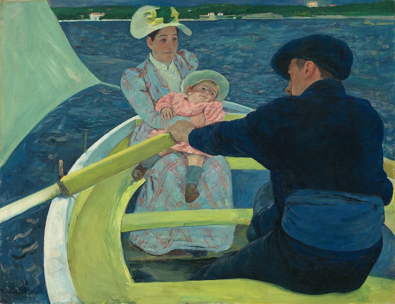
Why did Whistler put his mother this way and not that way? Why did Mary Cassatt angle the child and the mother kind of at angles to each other, which, as we mentioned, seems a little bit of an uncomfortable way to sit in a boat, but it had a very powerful effect on the sense of movement within the work. So by changing things, it’s also part of the process of asking why. Why does this work? How did the artist come about with this kind of a solution? We can ask, what if we took the boating party, if Mary Cassatt’s the boating party and changed it so it fit into the rule of thirds? What would happen then? So using Planal Maps in this way, it can let us explore what the original artist has done. It can let us explore what we think we might want to do. We can explore maybe a painting or a work that I’m working on, that I’m planning on, that I’m thinking about how I might want to arrange it. It lets me explore lots of questions, and I can use this whether I’m an artist trying to create my own work or as an art lover, which most artists are as well, who is trying to understand the work that’s been done.
Artwork:
Link to James McNeil Whistler, Whistler’s Mother at the Musée d’Orsay https://www.musee-orsay.fr/en/artworks/arrangement-en-gris-et-noir-ndeg1-974
Link to James McNeil Whistler, Whistler’s Mother on Wikipedia https://en.wikipedia.org/wiki/Whistler%27s_Mother
