A look at the colors and pictorial space that make this painting an enveloping experience.
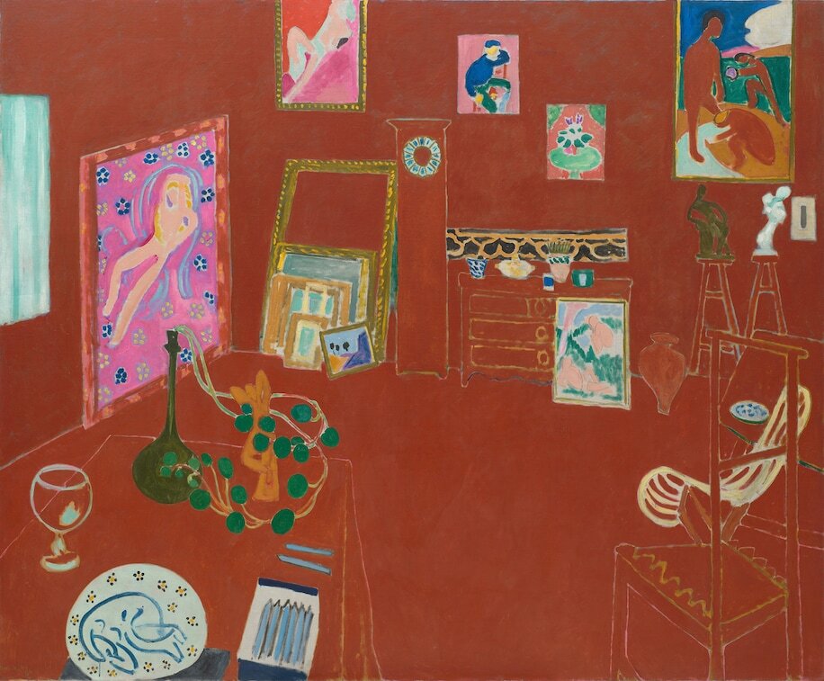
The Red Studio by Henri Matisse is a large, striking painting. Painted in 1911, it measures 6 feet tall by seven feet wide (71 1/4″ x 7′ 2 1/4”, or 181 x 219.1 cm) , and is covered mostly in a brick red color called Venetian red. That is a lot of red facing us at one time, enveloping us in the feel of the color. The use of a very shallow pictorial space further emphasizes the sense of being a part of this enveloping space. The experience felt standing in front of this painting is different than almost any other work, due to this combination of color and space.
Colors
While most of the painting is covered with venetian red, other colors give a wonderful interplay of converging and diverging accents. Instances of pinks, blueish reds create colors which Separate from the Venetian red. Objects in the space are outlined with a yellow ochre and a greenish blue, both left uncovered when the Venetian red was added.
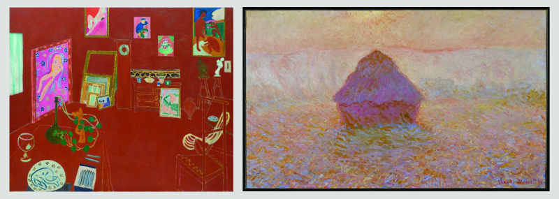
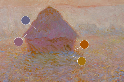
The use of the Venetian red in relation to the blueish red found in many of the paintings on the back wall create a similar motion to that seen in Monet’s painting Grainstack, Sun in the Mist, from 1891, where the blueish red is contained inside of the the yellowish red, thus controlling the Separating movements of the two colors. I spend a whole chapter examining the use of color in Monet’s painting in my book Color Movement Theory, and there are many similarities with Matisse’s use of color in the Red Studio.
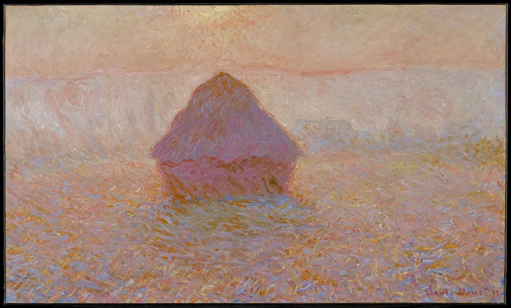
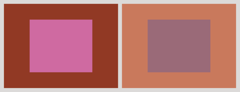
Here we can see examples of colors from Matisse and Monet. In both cases we can see a blueish red inside of a yellowish red. Normally these two colors would be Separating and heading in opposite directions. However, since the blueish red is fully contained within the yellowish red, that movement is contained, resulting in an exciting sense of potential movement. Clearly Matisse’s colors are more saturated, but the idea of the movement remains similar.
Click here to see my book Color Movement Theory.
The book focuses on working with color movements and relationships, as well as developing a personal understanding of colors.
Pictorial Space
The feeling of the space in this painting is much different than what we commonly see in work based in Western linear perspective.
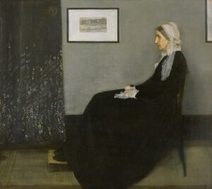
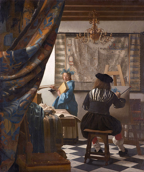
We can compare Matisse’s Red Studio with another studio painting, Vermeer’s Allegory of Painting. In the painting by Vermeer we observe the scene as an observer standing outside the space. In contrast, the space used by Matisse is more enveloping and there is less sense of separation between the observer and the observed.
Historical Background
This type of pictorial space used by Matisse has quite a lot of historical precedent. In order to understand what is happening in Matisse’s painting, it will help to first learn about the background behind such a use of pictorial space.
In 1903 and 1910 Matisse went to exhibitions of Persian miniatures in Paris and Munich.
The paintings had a great effect on him, he noted that:
the Persian miniatures showed me the possibility of my sensations. That art had devices to suggest a greater space, a really plastic space. It helped me to get away from intimate painting (Flam, 1978, p. 116).
We can see an example of a Persian miniature painting in the image below, Khusrau Seated on his Throne.
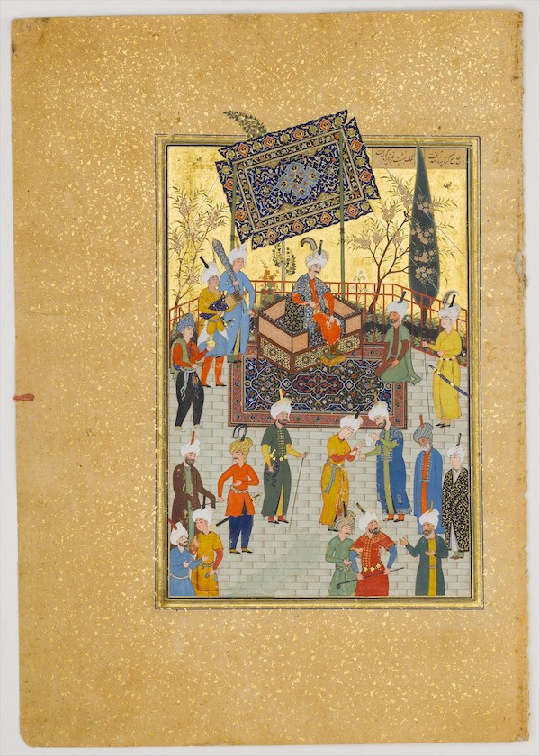
Notice how the floor is tilted up, and the space much flatter and shallower compared to what we saw in Vermeer’s painting.
There are many similarities in the use of space in the Far and Middle East, and it tends to differ quite a bit from the kind of space that we see with Western art with linear perspective. As noted by Kitaro Nishida, “space for the Western artist exists primarily in front of him, whereas for the Japanese artist space is around him,” (Westgeest, p. 25) it is a “space in which the self is situated.” (Westgeest, p. 20)
In the two previous examples, there is a similar tilting up of the floor and the shallowness of space. Furthermore, there are no shadows nor any clear indications of lighting. Lucien Rudrauf in his article, The Annunciation: Study of a Plastic Theme and Its Variations in Painting and Sculpture, refers to these types of composition as diffuse, coming from the sense of diffused daylight in the work, thus the lack of shadows. Discussing diffuse compositions, Rudrauf notes that:
Compositions of this kind are often made of a great number of details, none of which is marked with a predominant accent. The eye is not guided to go from one object to another. The attention scatters itself without hindrance over all parts of the whole, with nothing to lead it imperiously back to a center of radiation.
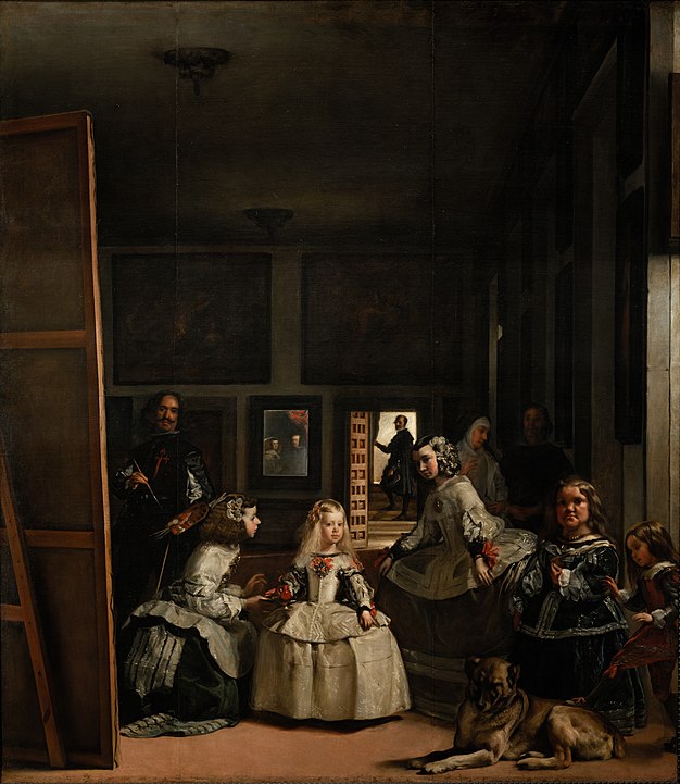
As another counterexample, in Las Meninas by Velasquez we see a deeper space based primarily on linear perspective, with a clearer sense of depth and lighting. Rudrauf terms this type of work scanned composition. Scanned composition:
spreads out before our eyes according to a spatial rhythm which is strongly hierarchical, allowing principal and secondary accents, marked with variable strength but always clearly perceptible.
Velasquez actually has ways of mitigating some of the spatial problems that can result from the pure use of linear perspective. I will discuss this in a future article, or perhaps in my upcoming book on pictorial space.
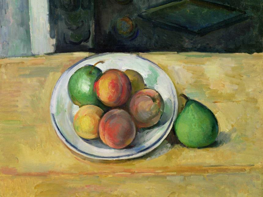
Matisse was not the only Western artist to use this kind of space. Most notably, we can see the creation of a tilted up and shallower space in the following works by Cézanne and Picasso.
Of Cézanne, Matisse said:
Look at Cézanne: never an uneven or weak spot in his pictures. Everything has to be brought within the same picture plane in the painter’s mind.” (Spurling, 2005, p.80)
We can see in the painting below, where Cézanne has tilted up the space, this creating a very shallow plane in which everything in the work lives.
In The Blue Room, Picasso creates a similarly shallow space, integrating all of the elements.
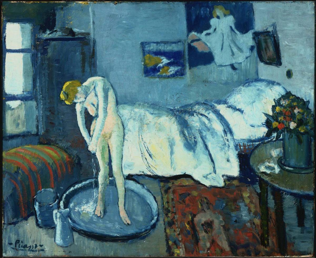
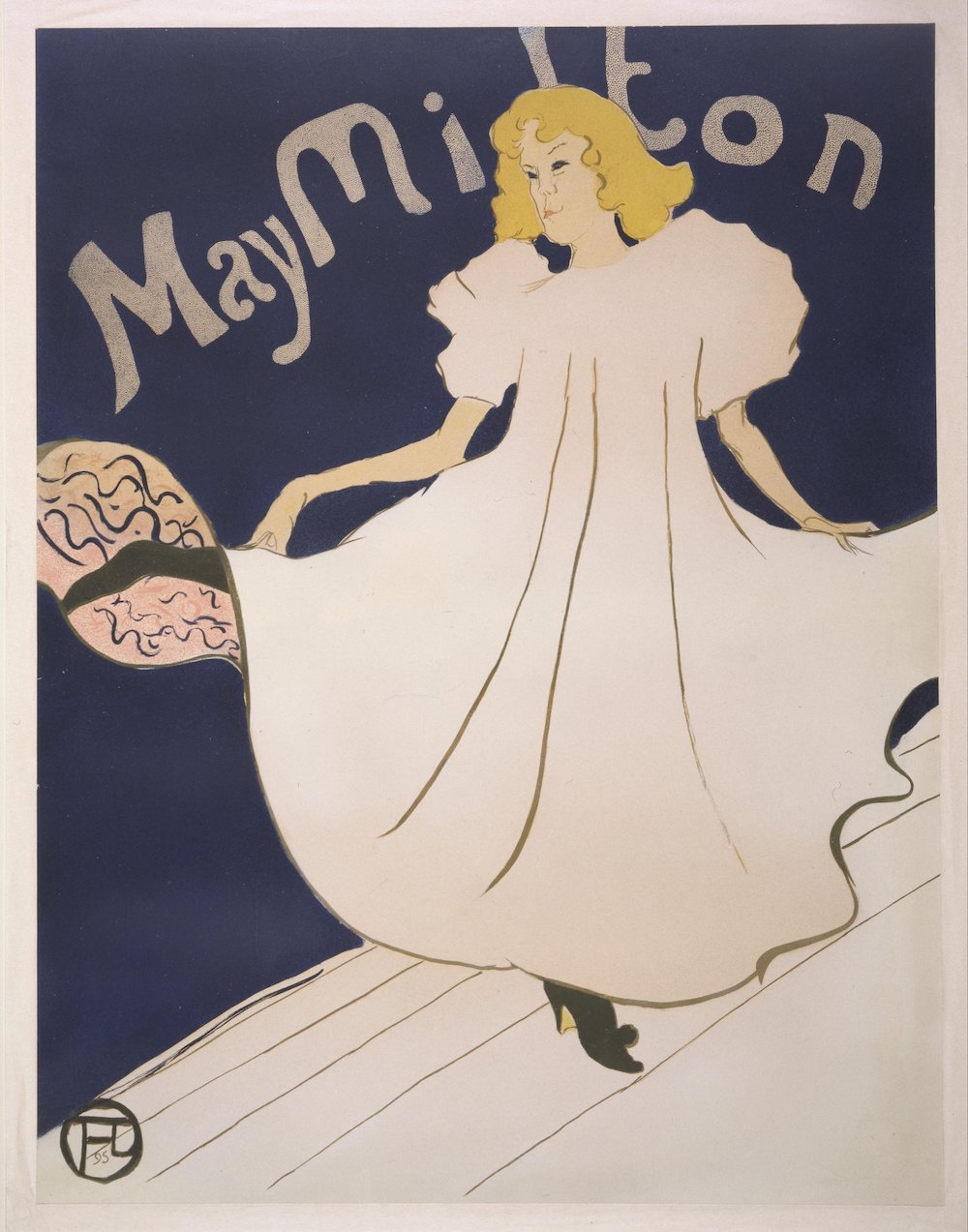
On the back wall of Picasso’s painting we can see a rendition of Toulouse-Lautrec’s poster May Milton, which also shows a shallow, tilted up space.
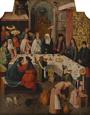
Similar use of space can be seen in other works of Western painting. The painting below, the Marriage Feast of Cana was originally attributed to Hieronymus Bosch, but now the artist is unknown as it was discovered that it could not have been painted earlier than 1550. Similar to previous examples, the floor is tilted up, and the space is flattened.
The use of color and space in paintings from different traditions is one of great interest to me, and I expect I will write more about it in future articles, as well as an upcoming books.
Please let me know your thoughts on this topic.
Thank you for your interest!
References:
Matisse Henri and Jack D Flam. 1978. Matisse on Art. New York: E.P. Dutton.
Rudrauf, Lucien. The Annunciation: Study of a Plastic Theme and Its Variations in Painting and Sculpture Source: The Journal of Aesthetics and Art Criticism, Vol. 7, No. 4, Special Issue On Aesthetics in France (Jun., 1949), pp. 325-348
Spurling, Hilary. Matisse the Master: A Life of Henri Matisse 1909-1954. United Kingdom, Penguin Books Limited, 2005.
Westgeest, Helen. 1997. Zen in the fifties: interaction in art between east and west. Zwolle: Waanders Publishers.