I’m really excited about this post because it actually comes from a question from a viewer of my YouTube channel.
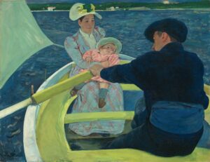
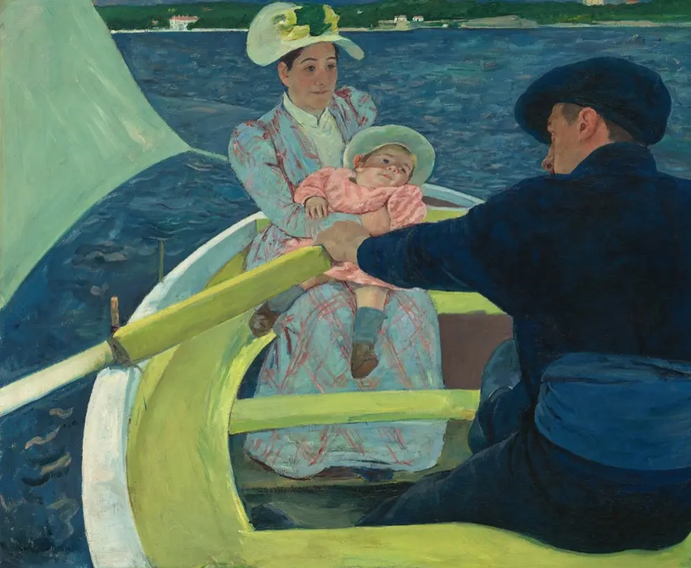
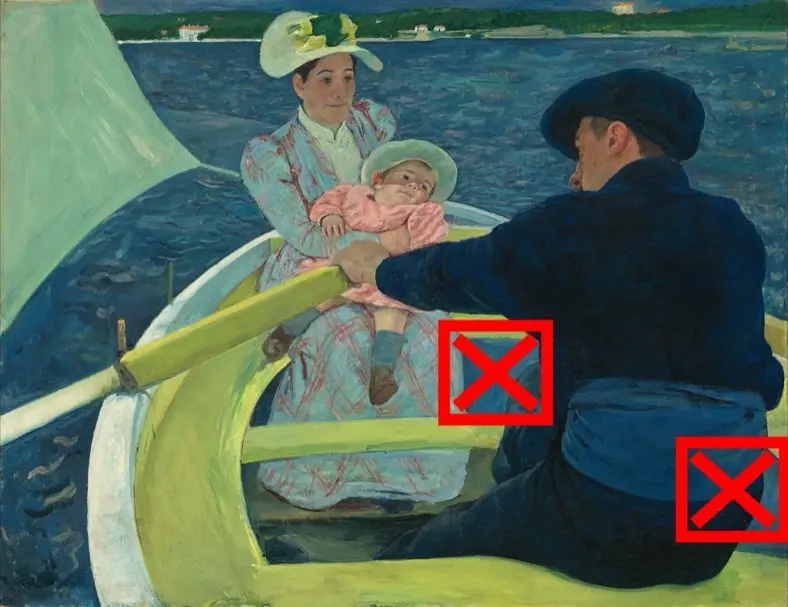
The question is, why are there holes in the boat? This is a painting The Boating Party by Mary Cassatt.
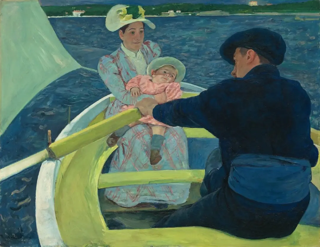
It’s a wonderful painting that we have looked at a number of times. However, we have yet to consider this question.
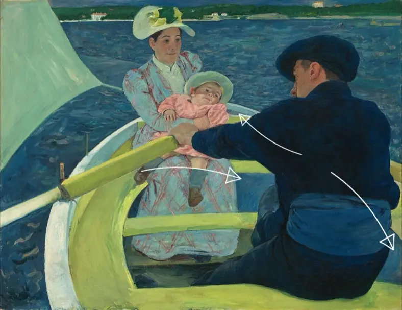
It really does look like there are holes in the boat, especially if you look at these two parts one on each side of the boatsman, as well as this little part at the very top of the boat. But even as we look around the boat, it looks like there are holes in the boat because the color inside the boat is almost exactly the same as the sea behind it.
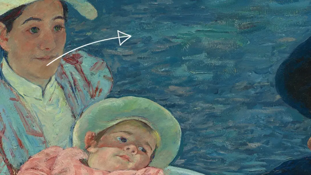
There are a few important differences between the color inside the boat and the sea. In particular, the way the paint is handled inside the boat is different than the way it’s handled in the sea. In the sea we can see the waves and the crests and not only is she painting those shapes, she’s also adding some highlights and some different colors.
Inside the boat, especially on each side of the boatsman, the paint is handled in a way that echoes his shape. The movement of the paint and the brushstrokes echo the foot and the hip of the boatsman.
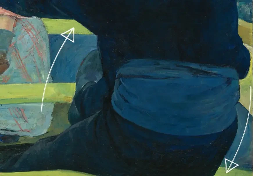
So even though they’re almost the same color, there is a different treatment of the paint. And that does give us some hint that these are two different spaces, though as we look at this painting we can really feel like there are holes in the boat and that is very strange.
Feeling and Analysis
We’re going to look at this in a few ways. First I want to focus on the feeling that it gives us, the feeling that this painting gives us and the feeling it would give us if we change it to be more like a traditional painting. Then as we go through this video, we’ll talk about some of the details and how she’s creating this. And at the end, that’s going to allow us to come away with two conclusions, and one question. And I think those are really important, so please do read to the end for those.
Not only do we have similar color inside the boat as we do in the sea behind it, the shoreline the space behind the woman is very close, and the sky above the shoreline is, once again, the same color as the sea.
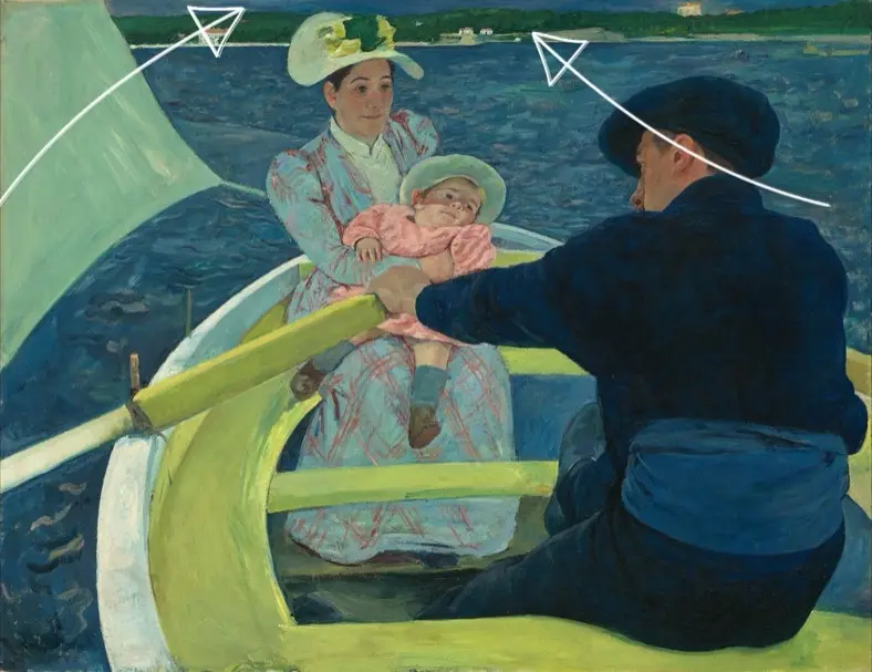
In addition we have this sensation where the boat is being tipped up. We’ve talked about that before. The idea of tipping up is very important. We think about linear perspective creating depth, whereas tipping up gives us a much larger space but a flatter space and a very different space.
If we make some changes to the painting, we can start to see some differences. First off, let’s start by taking those three little blue spots, the two next to the boatsman, the one at the very top. and let’s fill them in and make that kind of a brown color what we might expect from wood in a boat. and we can see already this is giving us a very different feel.
Now let’s go ahead and make the whole inside of the boat that kind of a brown color. Again, kind of the wood color you might expect inside of a boat.
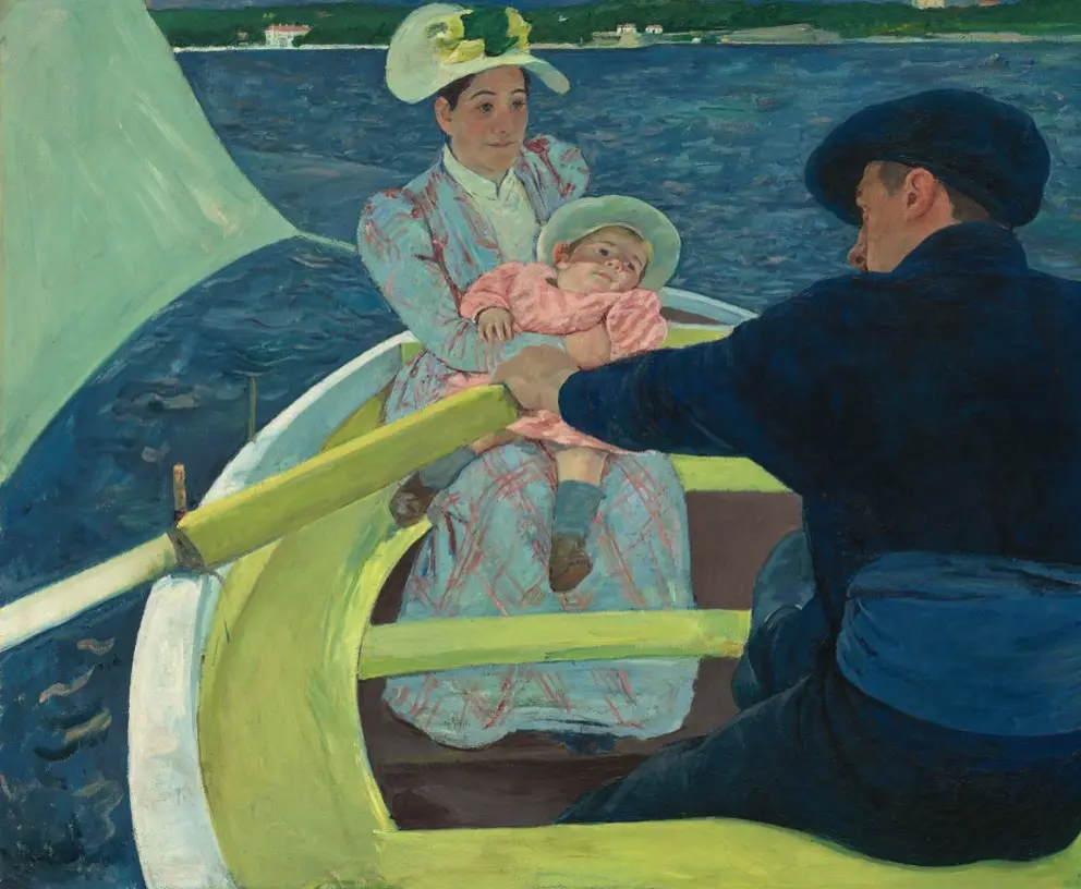
Let’s also make the boatsman stand out. Looking at the color of the sash and boot of the boatsman, they’re also very similar, that kind of blue color. Everything is kind of fitting into this blue color. Even the child’s socks, they seem to be the same kind of a blue color. So, let’s change those as well. Let’s make them stand out. Let’s make that more how we might think of a painting. We have people in the boat. They’re going to stand out. This is a subject we’re painting the foreground with the people in the boat. Behind them, we have the middle ground of the sea.
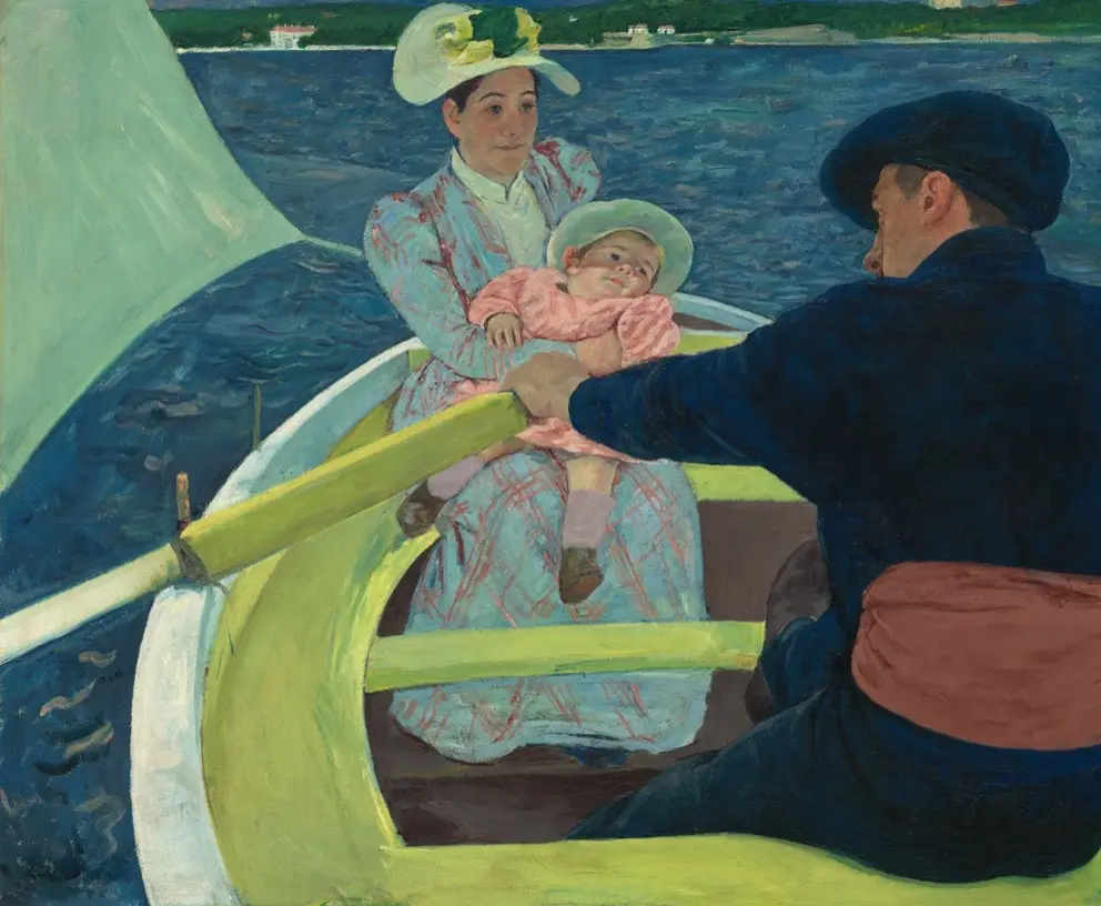
Let’s also take that shoreline in the back and make that a background. Let’s push that back so that it is far away a we would expect from a shoreline. In the original it is very close. Again, it is that idea of a very shallow space. Giving it depth, makes it so that we can go from the boat to the sea all the way back to the shoreline. Something that’s not happening in the original.
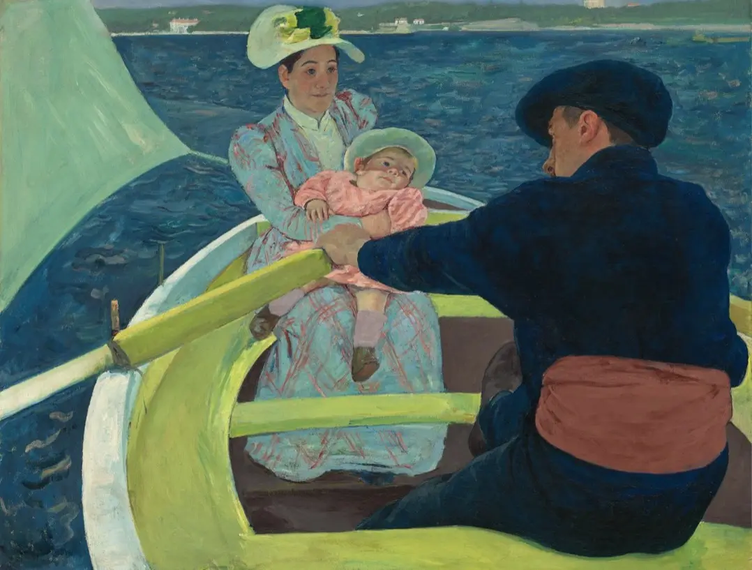
Take a moment to look at these two. Look at the original and look at this edited version. How do you feel? What feeling does each version give you?
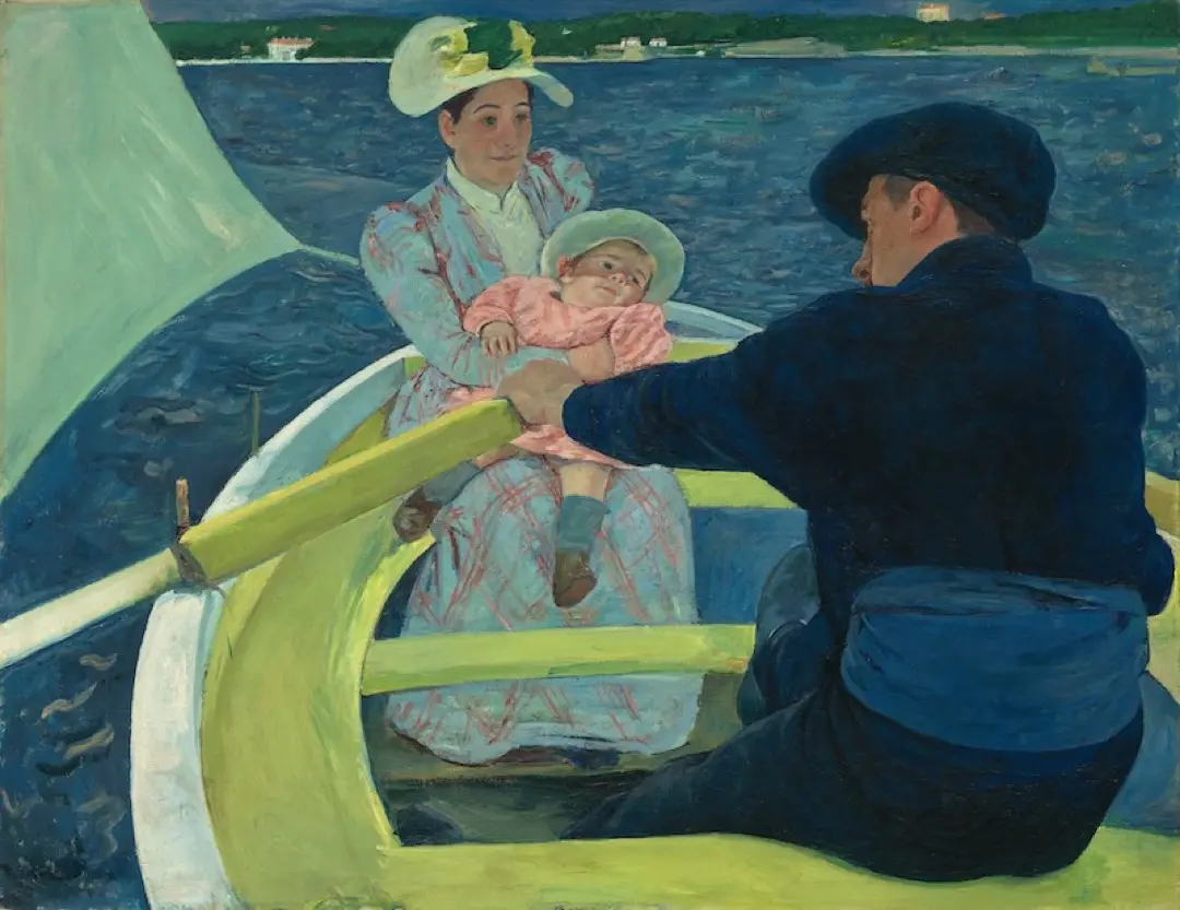
I will discuss my feelings about the painting here. I have also discussed this with some of my students and other people. I like to get different people’s points of view because a lot of times you’re going to see things or you’re going feel things that I might not notice. It is wonderful when we share our thoughts on these works. It helps to enrich all of us. We are here to understand art more deeply and by sharing we can help each other do that.
When I look at the original painting, everything is so close together, encapsulated in one very shallow space. It’s like a big hug. The woman is holding the baby in the sea but everything is very close. Nothing that’s going to happen. It’s not a big, scary, difficult space to kind of navigate through. On the other hand, when I give a foreground, a middle ground and a background. Now, the sea starts to feel really large, and the background is far away, and this woman is holding a baby on this boat in the middle of this really large, expansive sea. And that starts to get a little scary, and it feels dangerous to me.
However, we have to be aware of a transition we’re making. To follow our feelings in a painting, we have to fight our natural instincts in some ways. Our visual system didn’t evolve for the sole purpose of looking at beautiful artwork. It evolved for our safety and survival. So, it’s natural, and likely optimal that when we see the boat, we see the real possibility of there being holes, and the real potential for danger. Millions of years of evolution and natural selection have taught us to identify possible dangers. So all this talk of that feeling of safety and comfort in the original painting requires us to suppress that natural instinct. This is great for looking at art, but maybe not so great for keeping us safe out in the real world. That’s my feeling of it. But please do share yours. I’d love to hear.
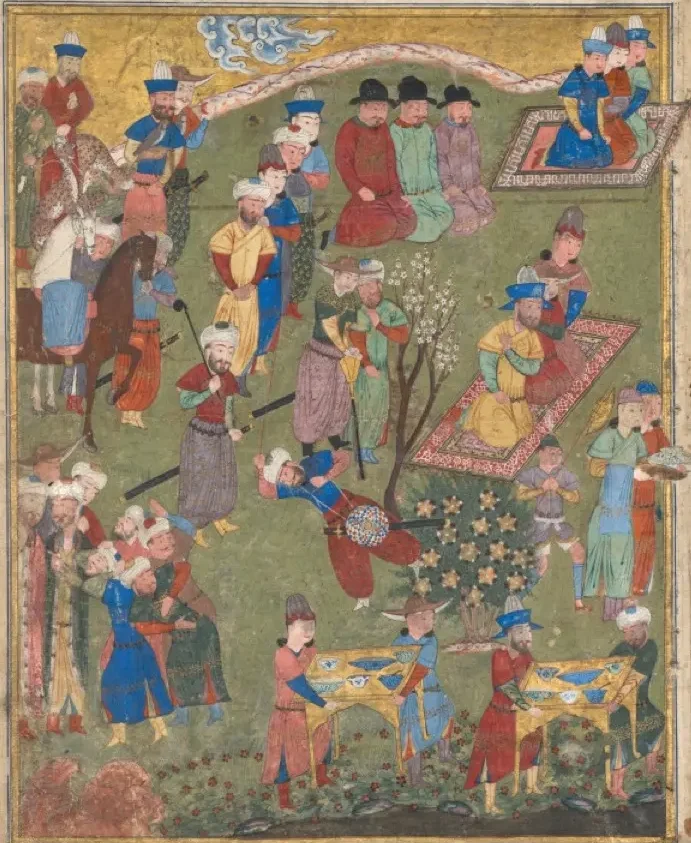
In the original painting, the space is very compressed and flattened, as we discussed. It makes it a very shallow space and a space that feels as a unified whole. It feels as though we can move through the space easily. But where does this kind of idea come from? Well, we’ve seen it before. We discussed it in my post on tipping up. We can see an example of tipping up of pictorial space in this Persian miniature called the Royal Reception in a Landscape. It’s from somewhere between 940 and 1025.
We can see in this painting that there’s this unifying green space that all the figures are in this unified green space of probably the grass and the landscape but what this does it allows us to move through that space and we can in a sense visit each of the figures each of the people in this landscape even though it’s a little strange in that it feels like some of them are maybe looking at from above maybe we’re looking at from straight on with other ones but nonetheless the way it’s painted with this unified color. it feels like we can move around and, in a sense, visit with any one of them.
Diego Velázquez
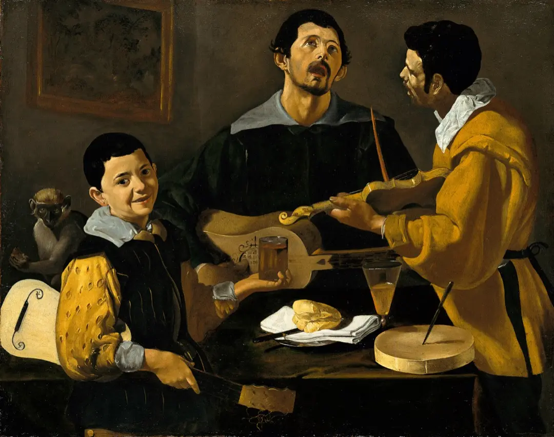
Persian miniatures are not the only paintings to tip up pictorial space in this way. Picasso and Matisse did this, and we can also see in this painting by Diego Velázquez. This painting is called Three Musicians. It’s from somewhere between 1616 and 1618. Certainly much more recent than the original Persian miniature, but still quite some time ago, and certainly a few hundred years before Mary Cassatt was painting.
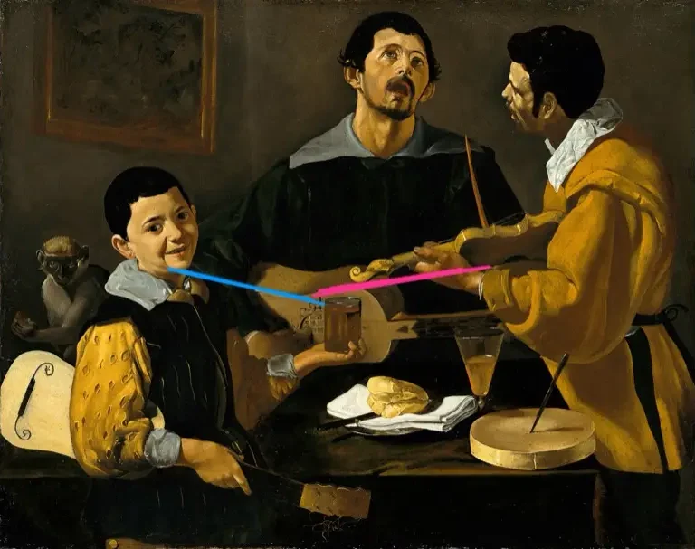
We can see that Velázquez is creating this flat space. He’s tipped up the table. Everything should be falling off that table. Even the guitar is strangely tipped, as it seems almost as if there’s two perspective points of view that we’re seeing that guitar from.
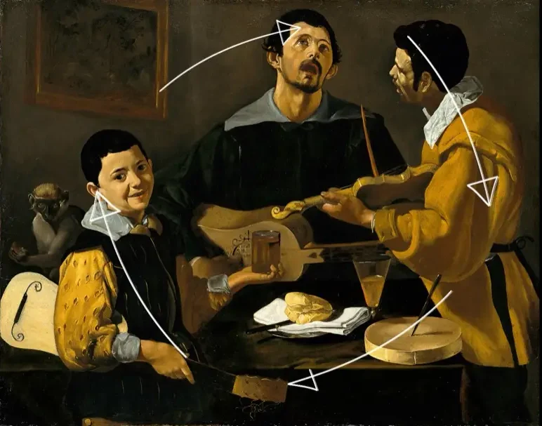
Velázquez is one of the great masters, so this is not happening by mistake. This is something he’s doing on purpose, and he’s doing it again to create this unified space so we can move through and maybe in this case feel the harmony and the unity that they’re creating with their music.
Mary Cassatt is creating a similar space by linking that space with this unifying blue color. The color of blue is very similar in terms of how red or how green it is and the saturation is also very similar so the strength of the color. how much color, how much blue we’re seeing. So, she’s using color, in a sense, to unify this space and create this idea of tipping up or this single plane, this unified space that everybody, the whole scene is living in.
Thomas Eakins
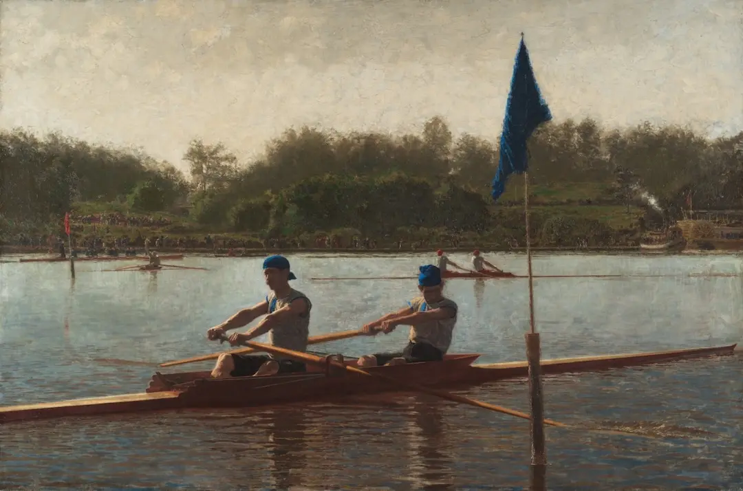
This is very different than what we might typically think of in terms of how we see space. Looking at this painting by Thomas Eakins called “The Biglin Brothers Turning the Stake” from 1873. We can very clearly see a foreground and a background. The figures in the boat in the foreground, and then more boats and the shoreline in the background. We can see that clear distinction just as we saw with that edited version of the Mary Cassatt painting.
Corot
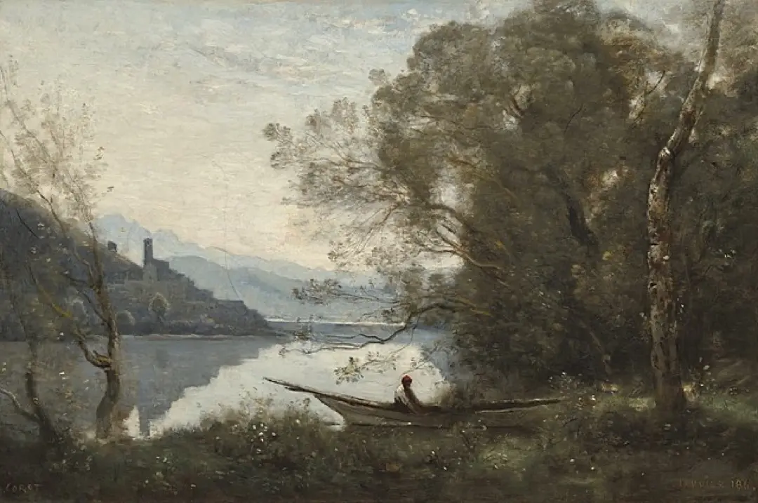
We see something very similar in this painting by Corot, “The Moored Boatsman, Souvenir of an Italian Lake” from 1861. We’ve talked about this painting previously. Once again in this painting, we can see a clear foreground, middle ground, and background. Even though this painting is very traditional looking, we can see that Corot has very subtly connected the foreground and the middle ground and the background. So they’re not completely disjointed, it’s not completely foreground, middle ground, background. He kind of tickles them, feathers them together so there’s a little connection between them. We can see this in the way that the reflection is just gently touching the grass. but pointing to the source of the reflection. We can see it in the strength of the mountaintop. The mountaintop doesn’t completely fade into the background. There’s a little bit of a emphasis at the top of the mountain in the way that it’s painted. This allows it to stand out a little bit so it’s not completely fading into the background. Even though Corot is creating this distinct foreground, middle ground, background, He’s also playing with that a little bit. This is something to think about. These ideas of foreground, middle-ground, background that we are taught as absolutes, perhaps, maybe it’s not always exactly so clear and distinct.
Two Takeaways
As I mentioned, we’re going to have two takeaways and a question, so let’s start with the two takeaways.
Takeaway One
One takeaway from a kind of technical point of view is how Mary Cassatt has used this field of color to create a single plane, one plane that everything lives on. And it doesn’t have to be completely flat. It can just be quite a bit flatter than we’re used to. We can still create that sensation without making it absolutely flat. So one takeaway is how we can work with space and we that can create that sense of either distance or flatness and compressed space.
Compressed Space
This idea of compressed space is very important. Cézanne is one of the… Artist perhaps most noted for this people like Hans Hoffman who’s one of the most famous abstract painters who brought Cézanne’s ideas of painting to the U.S.. That’s my lineage That’s where I learned a lot about painting and ideas of space, from people like Hoffman, de Kooning, Rothko and of course Cézanne, Also going back to Velasquez, as well as going back to Persian art and Chinese art.
This idea of compressed space is very important. it is a fundamental idea in art. It’s not a breaking the rules, as is sometimes assumed. Rather, it is understanding deeply the concept of pictorial space itself. Understanding how we can use it and how we might want to use it and making that choice.
Takeaway Two
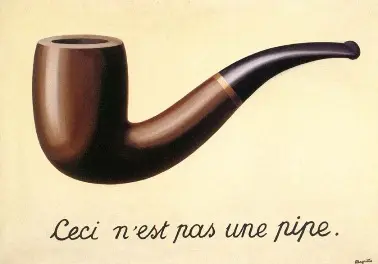
Another takeaway, and I think this takeaway really gets to the heart of the question. The original question is why are there holes in the boat? I wanted to talk briefly about this painting by René Magritte called “The Treachery of Images” or “The Pipe Painting” as I usually think of it. In this painting we see a very detailed very accurately painted pipe but underneath it says: this is not a pipe. What does that mean? What’s going on there? Why is he saying that? He’s saying this is a painting of a pipe. It’s not a pipe. A painting creates a world of its own. It’s a life of its own. It is its own being and it brings with it its own rules, its own way of living.
We often look at artwork and we expect the artwork to match exactly with how we see things. As if the world of the artwork should follow the same rules of the world we live in. Artwork lives in its own world, and artwork creates its own world. So just like Magritte’s pipe is not a pipe, Mary Cassatt’s boat is not a boat. It’s a part of a painting. It’s a boat in her painting, in her world, that she’s created, in the space that she’s created. It follows her rules. It has its own life.
When is a painting finished?
When you paint a painting, there is always that question, how do you know when it’s done? And one of the ways that we might say, oh, my painting is done. when it really has its own life. It’s taken on its own life. It’s its own being. It’s telling me, instead of me telling it what to do. It’s saying, this is who I am, this is how I live, this is my world. This is who Mary Cassatt’s painting is. This is the boat, this is the whole world in which it’s living.
Feeling the music at the symphony
One way I think of this is I was at the symphony a little while ago. I was listening to music and watching the musicians, the violinist, the cellist and everybody performing. It’s beautiful watching them play and thinking about what they were doing. But then I stopped doing that and I closed my eyes and I listened. and I allowed the music to flow through me to take me somewhere else. I wasn’t watching, I wasn’t thinking about what the musicians were doing or how the orchestra was playing. I was feeling the flow of the music, letting the music take me. The music was telling me who it is, what its world is, what it’s saying, what it’s feeling. The music was allowing me to go along with that if I chose. I chose was to listen to that, to feel that, and to let myself go with that. I think that’s very similar to how we can look at a painting.
Some artists and some paintings, want us to ask logical questions or look at it like a puzzle. What is that? What’s happening there? How is this working? How is that space working with that space? Tricks has the artist created. Some artwork is like that and some people enjoy looking at artwork that way. It’s not about a right or wrong way to approach art, it is about personal preference. However, some art, and I think actually a lot of art, is not doing that. For instance, as Magritte was alluding to, you might see a pipe, he may have painted a pipe, but it’s not a pipe.
It’s a world, it’s a feeling, it’s a life, and he want you to feel it, he wants you to engage with it. We don’t need to analyze it from a logical point of view. We don’t need to compare this pipe, or this boat, in Mary Cassatt’s case with the pipe that you might hold in your hand or the boat that you might be looking at on the shore right there. They’re not the same thing. One is a painting, a painting with its own life and its own being. The other is the thing itself. These are very different. the painting is not trying to recreate exactly what we see. A painting is using the idea of a pipe, or a boat, this idea of being in a boat in that whole scene, it’s using that idea to create something else. To create its own world and to become its own being.
With Mary Cassatt’s painting, if we look at it like a real boat. we can look at and say it looks like there are holes in that boat, I’m not so sure you want to get into that boat. At the same time, instead of analyzing it in that way, we can feel the scene. We can look at it. and let it envelop us, let it tell us what’s happening. We can let it tell us who it is, what world it lives in, and what world it’s creating. Allowing the artwork to share with us tell us what it has to say is a much more poetic way of looking at it. It is a more musical sense of feeling the resonance of the music, feeling the resonance of the painting.
Mary Cassatt: master painter
Mary Cassatt has created something that is not simple. She she wanted to create a single plane. She wanted to connect the boat with the sea. Mary Cassatt’s one of the great master painters. And this is a great example of her work. She has connected the boat and the sea through the use of the same color. But the way the paint is handled allows us to see them as distinct as well. They are the same color, but it also different. But if we just kind of feel it and look at it, we can let ourselves be immersed and let ourselves feel that boat and that sea merging and let that whole space merge together. A brilliant painting.
One, this idea of creating a field of color, a unified space, one plain or a very shallow plain. And the second one being that a painting is its own reality. It’s not a recreation of reality, it’s its own world. This pipe is not a pipe, this boat is not a boat. its own life and its its own being, and that being will talk to us if we allow it.
One question: which version in a painting class?
Those are the two takeaways and here’s the one question that I have: if we were in a painting class and we were to paint these two different versions of the painting, the original and the edited version, which version do you think that we’re most likely to get approval from both the teacher and the students in the class? Which version do you think might get a kind of curious response, as it to say, that’s not right, you need to fix this, you need to make a foreground, a middle ground, and a background. Would you be told that the boat, has a hole in it, that the boat doesn’t look right, that the shoreline is way too close, and needs to be pushed back. I think that in most classes. the edited version would be the one that would gain approval. the original version would probably gain criticism.
In my class
In my class, we talk about this kind of pictorial space, so with either version, we’re very likely to discuss these approaches. We’ll talk about you create a very shallow space or you create a very deep space. Why did you do that? Why did you want to? I want to make sure that the student understands what they’re doing and what the options are in order to have a larger sense of what art can be. I think a lot of these ideas like this tipping up and shallower space is a very important and very powerful idea. At the same time it’s not the only idea. As an artist or as a student working to be an artist, we want to understand what our choices are, what the possibilities are. We want to understand the decisions we’re making and make the choices that we want in order to create the artwork that we want to create. I want to help my students to grow to become artists themselves.
If you have other thoughts, other questions, other responses, please do share in the comments. I really appreciate it. And again, sometimes we’ll make a video about it or maybe it’ll come up as a comment. I think it makes this community so much stronger and much richer and when we’re sharing and we’re sharing our insights and our thoughts or our questions or Things we like, things we don’t like as much, what we feel. So let me know, what do you think of this painting by Mary Cassatt? Do you like the original version? Do you prefer the edited version? When we looked at some paintings that were similar, did that Persian painting, did the Velazquez seem strange to you, or does that make sense? Does the Eakins or the Corot make more sense to you? So please do let me know. Once again, thank you very much for joining me and I look forward to seeing you again next time.