What makes for clarity in a painting and how do we use it?
Let’s start by clarifying what I mean by clarity, and then we can talk about ways to use it.
When we talk about clarity in a painting, a photograph, or really anything that we see, we’re thinking about clear details, clean lines, crisp edges, so we can see very clearly all the little details and intricacies of what we’re looking at. Normally when we think about using clarity in a painting, the idea is pretty simple. Things that are closer to us are easier to see. Things that are further away, they’re less clear, they’re less detailed. It’s harder to see them clearly. That’s how we generally apply the idea of clarity, and we see it in an atmospheric perspective. Things that are close to us are very clear. Things that are further away get a little more distorted, a little gray, a little easy to see.
But a lot of paintings don’t do things that way. A lot of artists apply this idea in a very different way. They’ll do it in order to change pictorial space, to change how we feel the space, how we see, the story that they’re telling, and the impression that they’re giving us. How do we enter this space, this world that they’ve created? How do we experience it? How do we feel it? So let’s take a look at, first the general ideas of how to use clarity, what it is, and then we’ll look at some other ideas of how we might apply it.
To understand, let’s review a bit of our lessons from atmospheric perspective. When we think about atmospheric perspective, if we imagine ourselves looking out over the distance, we’ll notice a few things. The colors change, they get lighter and more muted, which is to say, less saturated or grayer. They get softer, especially around the edges. There’s also less clarity, less detail, and less contrast. The colors also tend to get bluer. However, that’s not always the case, and there are caveats to that. So we’re going to talk about that aspect in a separate post in order to keep this focused and clear. For this post, we’re going to focus on the question of clarity.
Clarity composes most of the changes. When we see things in the distance, they tend to get less clear. However, we’ll see that some artists will turn this idea on its head, sometimes, literally.

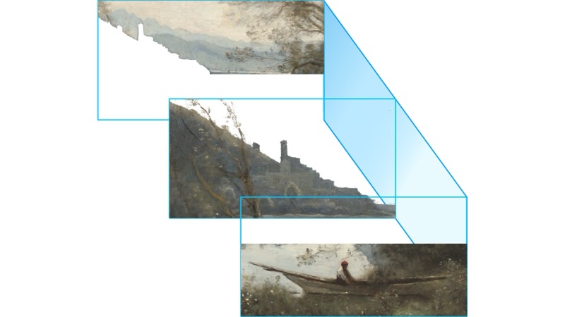
Let’s take a look at this painting by Corot, the moored boatman, souvenir of an Italian lake from 1861. We can see three layers in the painting, the boatman in the foreground, the castle on the hill in the middle ground, and the mountains in the distance. As we go back further into the painting, the colors change. They become bluer, softer, less clear, and less saturated, everything that we discussed previously.

This is happening because as we progress from the foreground, through the middle, and into the background, there’s an increasing amount of atmosphere between us and the objects we’re looking at.
Imagine opening your eyes underwater (I recommend wearing swimming goggles). You can see pretty clearly right in front of you, but very quickly, things get more aqua in color. They get darker, more unclear, and very quickly, we can’t see much at all in the distance. Of course, the atmosphere is not the same as being underwater, otherwise it’d be hard to breathe. The atmosphere is made up of a mixture of gases, water, in all three phases, liquid, solid, and gas, and solid particles called aerosols. An important difference for artists is that, with atmospheric perspective, for the most part, colors get lighter as we go further back into the distance, whereas as we look underwater we can see that things get darker as they move into the distance. We tend to say that with atmospheric perspective, colors get lighter in the distance, and this is largely true, that is, darker colors do tend to get lighter, but the very lightest colors also get just a little darker. This makes sense when we think about the atmosphere getting in between us and them. It would be hard for the very brightest of whites to appear so white with all of that atmosphere in the way. It’ll naturally get slightly grayer, less saturated, and, as it turns out, we’ll generally see the whites become a little bit more red rather than a little bit more blue.
In general, what this means is that as we move back into the distance, there’s less of an overall value range. So we tend to lose the very dark and very light ends of the tonal range. This accounts for the fact that there’s less contrast in the colors as there’s less value range. It also means that if we want to move forward something that would normally be in the distance, we can use colors with a strong value, such as a very dark or a very light color, especially if we can create a strong value contrast with the colors around it.

For example, if we take this print by Hiroshige, the shoreline and the buildings on it stand out quite clearly and appear quite close to us, almost as near as the boat and the water in the foreground.
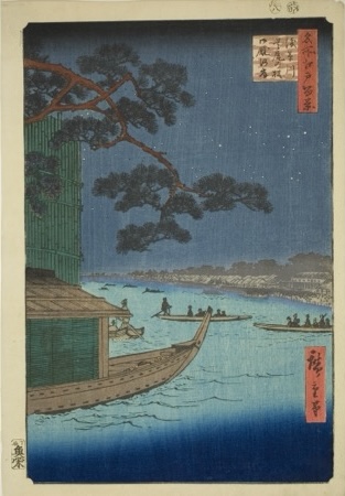
However, if we lighten the shoreline and then also lighten the buildings on the shore, now we have a nice traditional atmospheric perspective.
Of course, Hiroshige was perfectly capable of using atmospheric perspective. Hiroshige is one of the most famous Japanese printmakers. In fact, I think he may be one of the most famous printmakers ever. He certainly had an important influence on artists such as Monet and Van Gogh. Given all of that, it’s not surprising that he was a master of his craft. And as we can see from the mountains receding in the distance and these other works, he was perfectly capable of using conventional atmospheric perspective when he wanted. But the point is, he also understood the underlying principles so he could use them to shape space as he wanted. He could pull space closer to create the feeling that he wanted. We can see how much the feeling of the scene changes between the original version and the altered one. The altered version feels more clinical and technical, befitting a work attending to the principles of atmospheric perspective. The original version, on the other hand, with the shoreline crowding in, gives us a much closer, more intimate feel, perhaps better fitting a work in which a pleasure boat features so prominently.
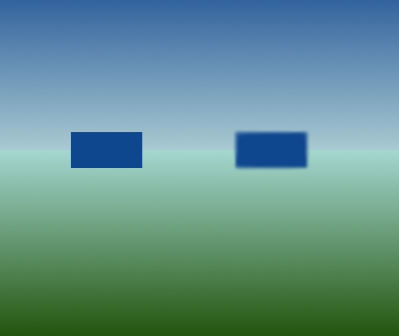
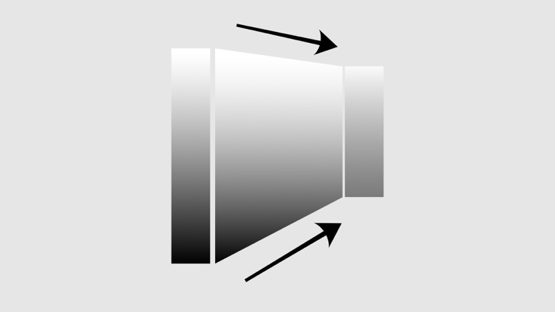
Edges are extremely important. They can help objects to appear to move back and forth in space. The only difference between these two shapes is the clarity of the edges. The one on the right with the softer edges appears to move back in space, while the one on the left with the crisper edges appears to move towards us, or forwards in space. In fact, when we talk about clarity and detail, in large part we’re talking about edges. If we can’t see the edges of things clearly, then everything starts to blend together and they lack detail and clarity.
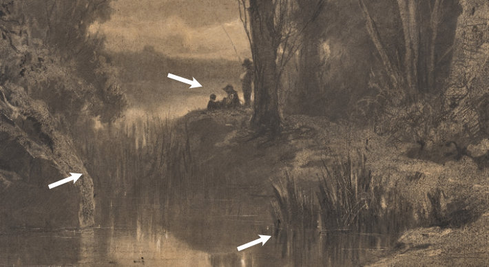
Edges can in fact provide us with a lot of diversity in how they work and what they can do for us. If we look for example at this charcoal drawing called “Three Fishermen Along the Banks of a River at the Edge of a Forest” by Adolphe Appian, we can see that for the most part the things in the foreground, like the plants here on the river, the edges are clearer than the same kind of plants as we move back slightly further in the distance.
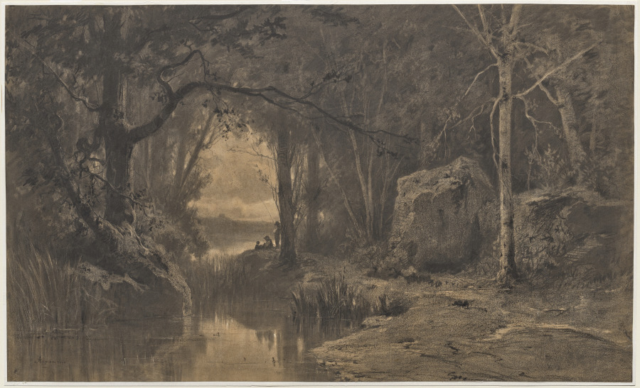
But at the same time, because the title tells us the that the painting is about Three Fishermen Along the Banks of a River, we can see that these three fishermen, their edges are quite clear and they stand out very clearly against the background, because he wants us to see that.
So we can use the idea of edges and where they’re clearer and where they’re softer to help direct our vision. So it’s not only a thing of what’s close is clearer, what’s further is not as clear. We can play with this quite a lot to direct where our vision is moving throughout a work.
Similarly, if we go back to Corot’s painting, we can see that once again we have these vegetation in the foreground and that the edges aren’t as clear. Or if we move up into the big tree in the middle of the ground, there’s a lot of softness there. But if we go into the lake, we can see that the tower here is quite clear. The edges are clear. It stands out very distinctly against the background, because he wants to draw our eye there. In fact, even the reflection of that whole building is very clear. We can see the steps of it going up, going up in space but also going up and back in the reflection in the water. So we can use edges in very interesting and distinct ways. It’s not only a question of what’s close is clear and what’s further in the background is less clear. We can play with these quite a bit to make it work for how we want, for how we want to lead the eye through a painting.
We’ve taken a little look at the idea of clarity as expressed through the principles of atmospheric perspective. And now we’ve also seen how we can apply these principles in different ways. I think this is something really important to consider. These are principles of how things function in space. They’re not rules telling us how we must use them. That’s the key. How we use them is really a function of what we want to say, what we want to express, and to understand the possibilities. A great way to do that is to understand the wide range of possibilities of how we use them. We can look at all these great artists that have come before us, what they’ve done, not to tell us what we have to do, again, but what we can do, what we can think about. Ideas that we can consider.
Just as in the previous post on planal Maps where we looked at how some other artists have used space to give us ideas to think about how we might want to use space. In this post we’re looking at how some other artists have used clarity, atmospheric perspective, to create a sense of pictorial space, to think about how we might want to create pictorial space. How we might want to work with clarity, atmospheric perspective, these different principles, in order to create the idea, the feeling to tell the story that we want to tell. And I think that’s really important. When we study principles, we’re not learning rules that tell us what we must do. We’re learning principles that guide us to understand how things work and what are possibilities to how we might use them. So as we work in our own paintings or as we go to museums and galleries or any place where we might have the opportunity to see art, we can think about what’s possible, what we want to say. When we look at other people’s art, we can think about what was this artist saying, how is this artist using these ideas to convey the story, to tell the, to share the feeling, to create the space that they wanted to create in order to share with us what they were trying to say. And so in our own artwork, we can also think about that. What do I want to convey? How do I want to use this space? How am I trying to let the viewer enter this world and view it, understand it, feel it, roam around in it, shift through it? What’s the feeling? What’s the space that I want to create? And we can start to think about it and a great way to start to think about these possibilities is, as we’ve done here, to look at what some other artists have done, think about what they’ve done, why they’ve done it, and then consider, okay, how might I want to use these principles and what might I like to do? I hope you’ve enjoyed this video and hope you found it interesting. Please like and subscribe. There’ll be more videos coming and I hope to see you again.
Artwork:
Jean-Baptiste-Camille Corot, The Moored Boatman: Souvenir of an Italian Lake at the National Gallery of Art https://www.nga.gov/artworks/195865-moored-boatman-souvenir-italian-lake
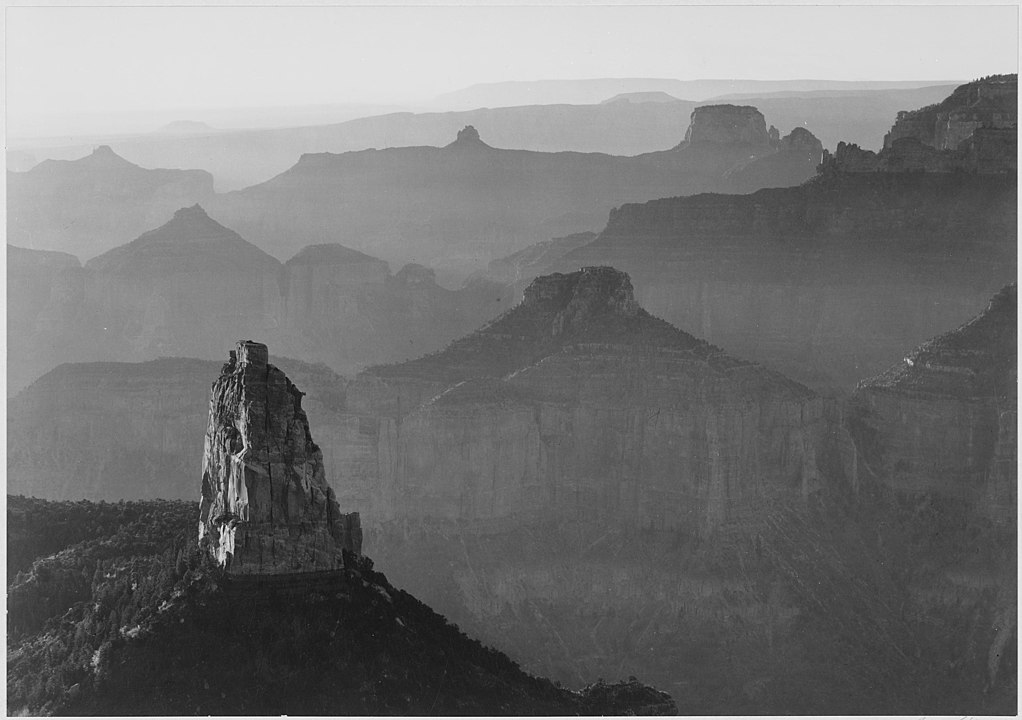
Ansel Adams, Grand Canyon
https://commons.wikimedia.org/wiki/File:Ansel_Adams_-_National_Archives_79-AA-F03.jpg
Hiroshige, Pine of Success and Oumayagashi, Asakusa River (Asakusagawa Shubi no matsu Oumayagashi), from the series “One Hundred Famous Views of Edo (Meisho Edo hyakkei)”
https://www.artic.edu/artworks/34094/pine-of-success-and-oumayagashi-asakusa-river-asakusagawa-shubi-no-matsu-oumayagashi-from-the-series-one-hundred-famous-views-of-edo-meisho-edo-hyakkei
Rembrandt, The Mill
https://www.nga.gov/artworks/1201-mill
George Inness, Sunrise
https://www.metmuseum.org/art/collection/search/11235
Paul Cézanne, Mount Sainte-Victoire
https://www.clevelandart.org/art/1958.21
Edward Hopper, Nighthawks
https://www.artic.edu/artworks/111628/nighthawks
Bada Shanren (八大山人), Fish and Rocks (魚石圖)
https://www.clevelandart.org/art/1953.247
Diego Velásquez, Las Hilanderas
https://en.wikipedia.org/wiki/Las_Hilanderas
