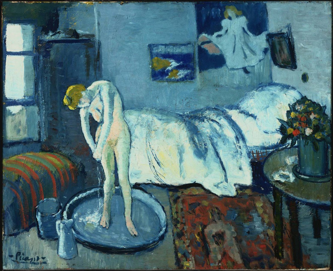
This painting, the Blue Room by Picasso, can strike us as a bit, well, disconcerting. Given the incredible angle of that floor, I’m not sure how the woman in this painting is actually managing to stand up.
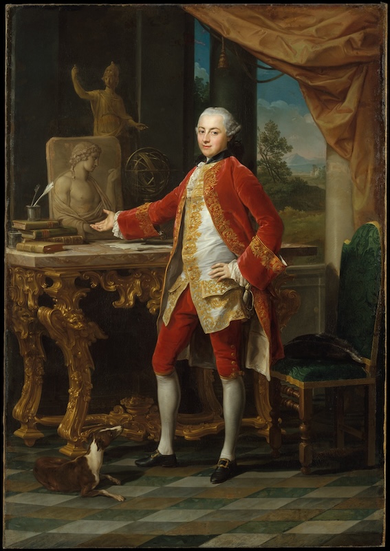
When we think of a floor in a painting, or really, when we think of the ground, we usually think of something that we can stand on, something fairly horizontal-ish. Something like this. Something like we see in this painting, “Portrait of a Young Man” by Pompeo Batoni, from around 1760 to 65. Pretty nice, flat, solid ground.
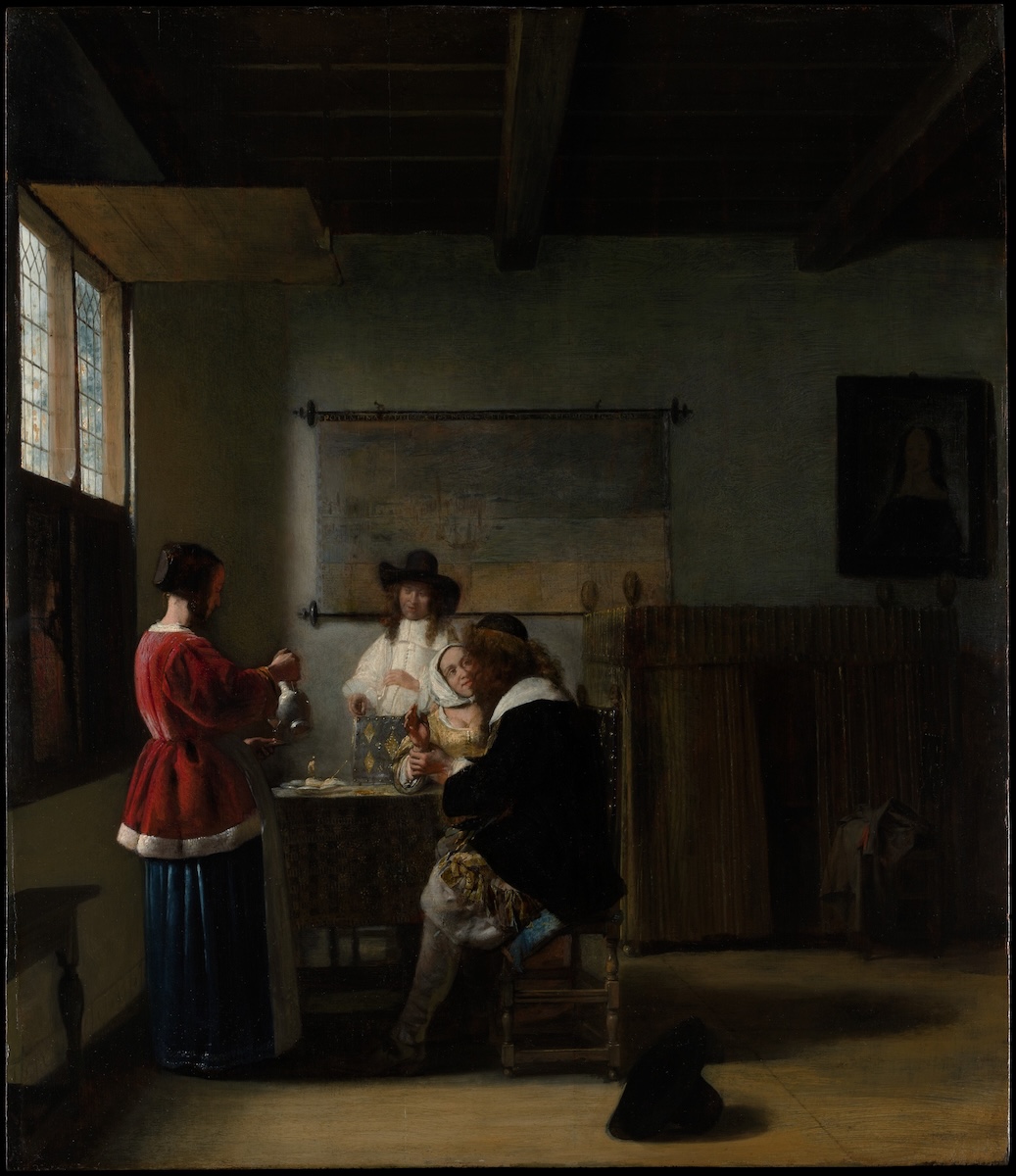
Or maybe something like this in this painting by Peter de Hooch. These paintings give us a nice, solid, reliable feeling of the ground. And why wouldn’t they? That’s the way the ground tends to work.
Generally, when we think about the ground, we like to think about something that’s nice and firm and flat and good to stand on.
And if we look at some paintings, we’ll see that in a lot of paintings, we’re used to seeing a nice, firm, steady, stable, flat ground. But some of these paintings we see, the ground really slopes away really strong, really fast. And it doesn’t feel like it feels even worse than this. Like, I can’t really stand on it.
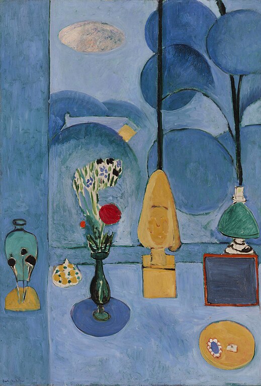
But it’s not just Picasso who did this. Here’s Matisse doing the same thing in his painting, “The Blue Window” from 1913.
We can see the object sitting on a surface that is closer to vertical than horizontal. Without Velcro or glue, it’d be hard for them to stay there like that. However, before we go thinking that Matisse was crazy or had bad eyesight or was really bad at linear perspective, let’s try thinking of it in a different way. Imagine ourselves standing in front of the window, looking out through the window, and then looking down at the window sill and the objects standing on the window sill. Then take these two different vantage points and stitch them together into one unified image. Suddenly, this can start to make a bit more sense. It might feel a bit strange, but it’s not insane.
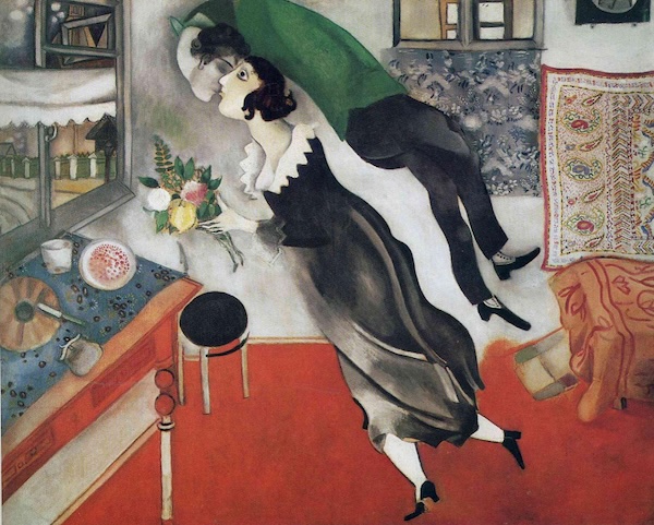
We can also see this tipping up of pictorial space in Marc Chagall’s “The Birthday” from 1915. This seems appropriate as the figures are floating, so we would expect to see a bit of an unusual perspective. The figures are floating, but we’re actually looking at them from the side. So we need a way to make it look as though we’re looking down at the rest of the scene rather than being at the same level of everything. Tipping up the surfaces below the figures achieves this effectively. It also gives the scene a playful, magical feeling, whereas if we had used strict linear perspective, it would feel much more mechanical.
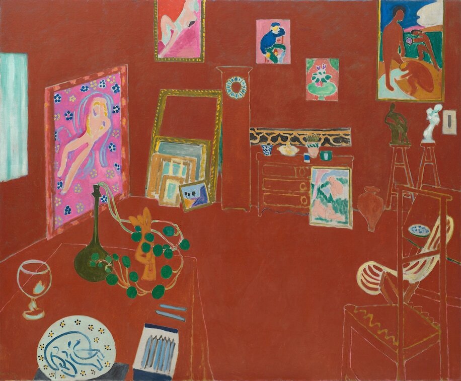
As we’ve seen, Matisse used this idea space in a number of his paintings, The Blue Window that we saw before, and The Red Studio that we see here. The use of one overarching color in the red studio also helps to amplify this altered perspective, creating a unified space that we can feel enmeshed in.
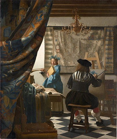
This sense of being in the space, being in the studio, is quite different than what we see with this painting by Johannes Vermeer, the allegory of painting. In Vermeer’s painting, we feel that we are standing outside the studio, looking in.
Before painting the red studio, Matisse went to a number of exhibitions of Persian miniature paintings. These works greatly influenced him and influenced his painting style and his use of pictorial space. Of them, he said, “The Persian miniatures showed me the possibility of my sensations. That art had devices to suggest a greater space, a really plastic space. It helped me to get away from intimate painting.”

We can see an example of Persian miniature painting in the image below, Khusrau seated on his throne. The sense of perspective in this painting is very different than the linear perspective that we’re perhaps used to. For example, see how we can look right down at the carpet as if we’re standing right in front of it or perhaps hovering over it.
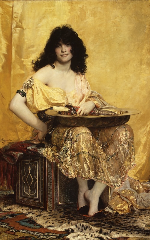
Compare this with Salome by Regnault, where we see only a small part of the rug due to the effect of linear perspective. While the Persian painting might seem quite unrealistic to us at first, if we imagine ourselves to be there in the scene, then we can see it as being quite dynamic, in that it allows us to see around and be a part of the situation.
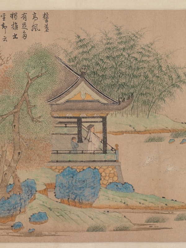
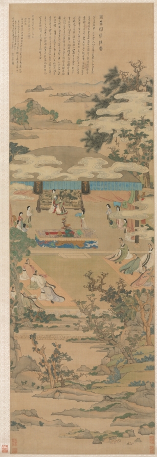
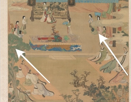
Similarly, in the painting “Wang Xizhi Watching Geese” from 1295 by Qian Xuan, the tipping up of the building allows us to see the situation inside. Interestingly, not all the landscape outside the building is tipped up in the same way. This painting is from 1295, so this way of tipping up space is not new in the history of art.
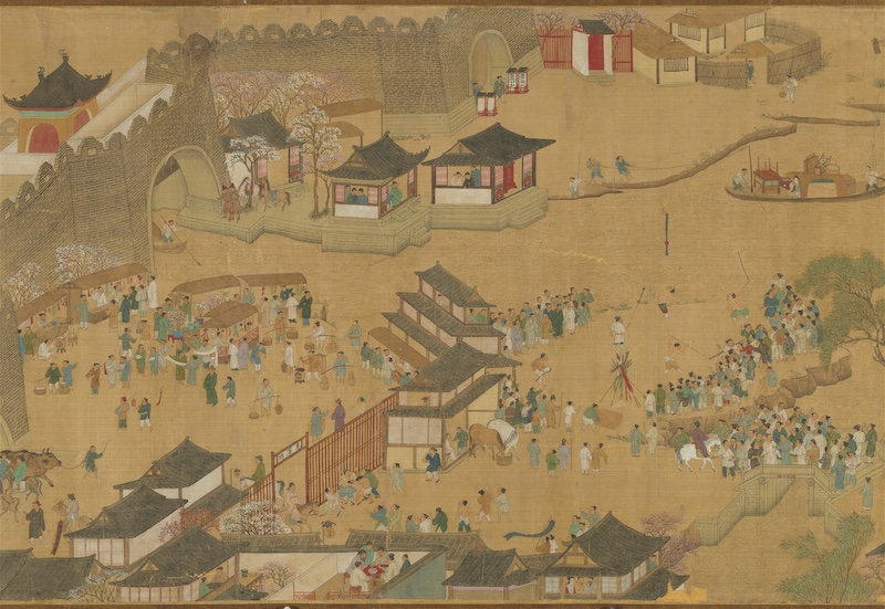
In other paintings, we might see the whole scene tipped up, such as this painting by Zhang Zeduan. This was probably painted in the early to mid 1100s.
In her book “Zen in the 50s, Interaction in Art Between East and West,” Helen Westgeest quotes a description of the Japanese ways of using pictorial space. It says, “The space in art from the Far East is not the space facing the self, but the space in which the self is situated.” So if we consider this idea of space, if we think about ourselves as being in the space and looking around, then things start to make a bit more sense. This is very different than the space in linear perspective.
In order to accomplish this, we must forego the idea of converging lines and vanishing points. Not only are the lines not converging, but we can see that in some works they actually get wider apart. As in this painting, “Lady Xuanwen Giving Instruction on the Rights of Zhou” by Chen Hongshou. This widening of the space allows us to see further into the space and be a part of what’s happening. The space is opening up as we go in, as if it’s inviting us in. The further we go in, the greater the space. This is a reverse of linear perspective, where the further we go in, the less space there is.
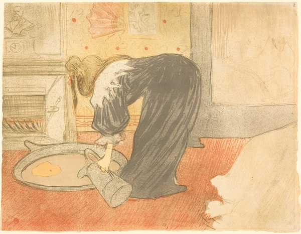
Many examples show what might seem like a mixture of these two perspective ideas. Here we see Toulouse-Lautrec tipping up the tub so we can see the woman working. As we’ll see in a few of our examples, this is a bit of a mixed case, where the tub is tipped up, but many other elements in the painting are not. This gives the whole piece more of a feeling of regular linear perspective, and we don’t notice the tipping up as much.
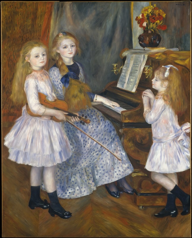
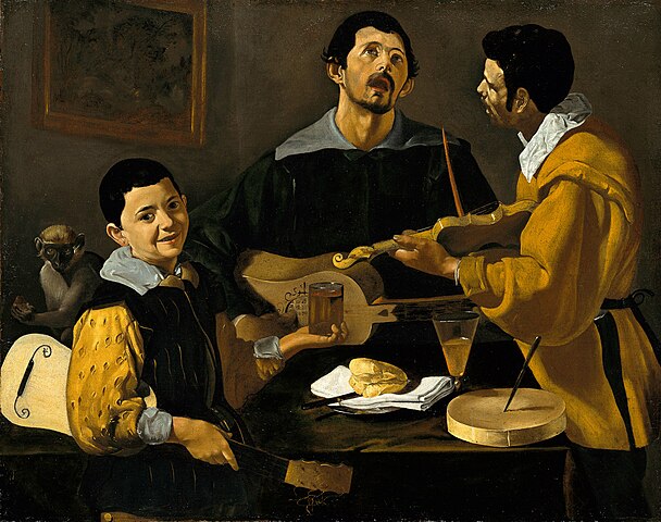

This mixed type of perspective is similar to what we might see in this painting by Renoir, as well as these two from Velázquez. Mixing these ideas of pictorial space can have a few uses. For one thing, it can allow for the artist to open up space without creating something that would potentially look very strange to Western audiences.
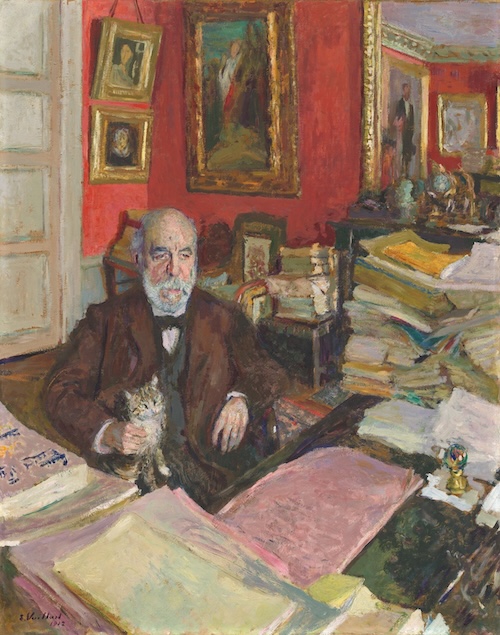
Also, as we see in this painting, Theodore Duret by Edouard Vouillard, the top half and the bottom half of the painting seem to have very different perspectives. In addition to hiding some of the effect of tipping up, it also allows for two separate spatial effects. We look down at the desk and can see all that he’s working on. At the same time, we can move back into the room and see the different spaces with all of the artwork. This is appropriate for Duret, who is an important art collector and critic.
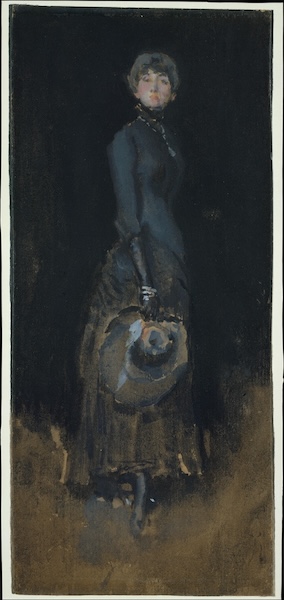
There are other ways to accomplish this sense of space. For instance, in this painting, Lady in Gray by James McNeil Whistler. While the bottom of the painting is quite abstracted, the shadow around her foot still descends in a vertical manner consistent with the kind of tipping up of space that we’ve been seeing.
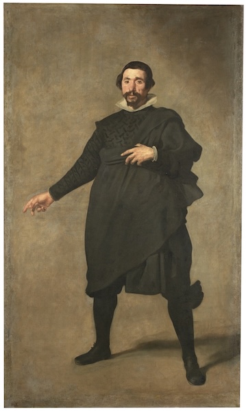
That’s in contrast to this painting by Velázquez, where even though the painting has more of an abstracted and empty seeming background, we can see that the shadow on the floor depicts a space consistent with a shape that would be described by linear perspective.
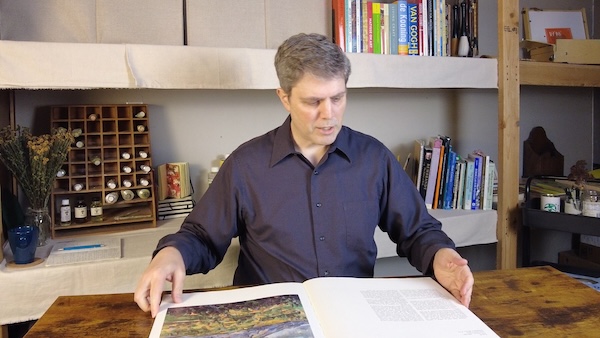
It’s a little bit like this book here. If we look at it folded, this is kind of like the back wall or the back plane and this is a floor. And this is how we kind of normally look at a scene with linear perspective. Here’s this bunch of text here, but here’s this wonderful painting by Cezanne and I’d like to see more.
So we maybe open it up and look at it vertically. And so now we’re seeing both parts of the book at the same time.
And if we look at a book like this, I guess I could look at it folded up this way.
More likely though, with a book like this, I’m going to read the text and I have the picture here as well. And I might read a little bit of it and then maybe refer back to this image and then go back to the text and go back and forth. And this way I can see all of it at the same time.
But that’s not how it would work with linear perspective. With linear perspective, for example, we kind of look at a scene like this. We cover one eye, we look straight ahead and whatever might be on the left, I’m looking straight ahead and I can see what’s on the left only because I can take in that part of the scene. When I look at it on the right, I’m still looking straight ahead and I can just see a little bit of whatever might fall into my field of vision on the right. Same thing with above me, same thing with below me. I don’t look up and down. I look straight ahead. But with this idea of tipping up, maybe I look down and see, oh, look at that fancy rug. That’s really beautiful. Oh, look at that canopy above us. Oh, look at this person here to the left. Look at this person over here to the right. And in fact, more than that, I’m going to walk around. I’m going to see this person here and further back in the scene. I’m going to see this person here further in front of the scene and they’re all the same size. That’s one thing I noticed when we look at these, is kind of tipping up images. The figures and the other objects in the space say, for the most part, tend to be either same size or very similar so that we can move around in the space and we can see everything there. Very different than with the linear perspective, where as we go back into space, things get so small that we know maybe something’s there, but we can’t really make it out. So it’s a very different idea. It’s much more of being in the space, something much more interactive, a little bit more like a movie or a video in a sense where we can move around and we can see different parts of the scene and see what’s happening.
It’s very different in linear perspective where we’re static. We set up in one spot and we don’t move. Whatever we can see, we see. But only from that one spot. And it puts us much more outside the scene, whereas this is much more inside the scene. We’re moving around, we’re looking around, we’re interacting with the people and the objects, we’re looking up, we’re looking down, we’re looking all around at the different scenes. And so it can feel a little strange in some ways because, well, we’re not used to seeing things quite like this. You know, we’re used to, here’s a page of the book and here’s another page of the book. But this seems strange until we realize that, oh yeah, sometimes we do actually look at things in this way. So we have to perhaps get used to a different way of looking at an artwork, understand how it’s talking about the space and talking about the scene and consider that, you know, for different circumstances, different. When I want to talk about a different situation or a different story, I might want to paint it in a different way. I might hope to see it in a different way, or at least seeing it with different ideas of pictorial space will tell me different things about it. It’s going to allow me to see different things about the scene and understand and experience different aspects of that scene in that situation.
Artwork:
Pablo Picasso, The Blue Room, https://www.phillipscollection.org/collection/blue-room
Pompeo Batoni, Portrait of a Young Man, https://www.metmuseum.org/art/collection/search/435623
Pieter de Hooch, The Visit, ca. 1657, https://www.metmuseum.org/art/collection/search/436678
Henri Matisse, The Blue Window, https://www.moma.org/collection/works/79350
Marc Chagall, The Birthday, https://www.moma.org/collection/works/79360
Henri Matisse, The Red Studio, https://www.moma.org/collection/works/78389
Johannes Vermerr, The Art of Painting, https://www.khm.at/objektdb/detail/2574/
https://en.wikipedia.org/wiki/The_Art_of_Painting
Khusrau Seated on his Throne, https://www.metmuseum.org/art/collection/search/453980
Henri Regnault, Salome, 1870, https://www.metmuseum.org/art/collection/search/437384
Qian Xuan (錢選), Wang Xizhi watching geese (王羲之觀鵝圖), https://www.metmuseum.org/art/collection/search/40081
Zhang Zeduan;張擇端, Qingming in a Ease and Simplicity https://theme.npm.edu.tw/opendata/DigitImageSets.aspx?sNo=04034088&lang=2&Key=^16^11&pageNo=3
Kitagawa Utamaro, Wedding Scene, a Triptych, https://collections.mfa.org/objects/489205
Raphael, The School of Athens, https://en.wikipedia.org/wiki/The_School_of_Athens
Chen Hongshou, Lady Xuanwen Giving Instruction on the Rites of Zhou, https://www.clevelandart.org/art/1961.89
Thomas Cole, View of Florence, https://www.clevelandart.org/art/1961.39
Henri de Toulouse-Lautrec, Woman at the Tub, https://www.nga.gov/collection/art-object-page.49174.html
Auguste Renoir, The Daughters of Catulle Mendès, 1888, https://www.metmuseum.org/art/collection/search/438014
Diego Velásquez, Three Musicians, 1618, https://en.wikipedia.org/wiki/Three_Musicians_(Vel%C3%A1zquez)
Diego Velásquez, Old Woman Cooking Eggs, 1618, https://www.nationalgalleries.org/art-and-artists/5531
Edouard Vuillard, Théodore Duret, 1912, https://www.nga.gov/collection/art-object-page.46545.html
James McNeill Whistler, Lady in Gray, 1883, https://www.metmuseum.org/art/collection/search/13245
Diego Velásquez, Portrait of Pablo de Valladolid, 1635, https://en.wikipedia.org/wiki/Portrait_of_Pablo_de_Valladolid