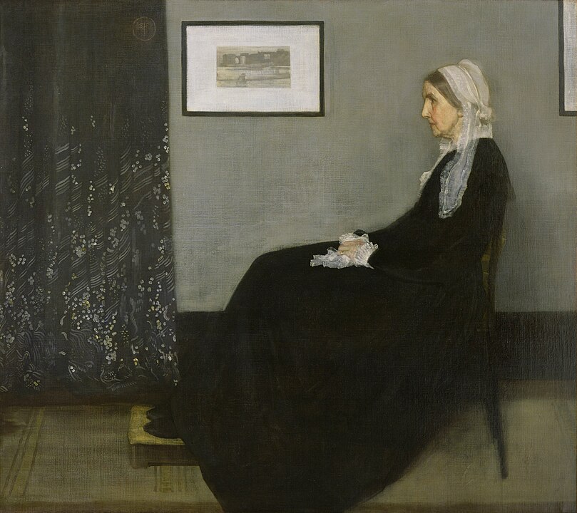
The painting Whistler’s Mother by James McNeil Whistler is a really wonderful painting. There’s a lot happening in it. It can seem kind of simple on the surface, but there’s a lot of really interesting conversations in the painting. We looked at it in a previous video, and the fact is there’s a lot more to say about it.
Previously, we used it in part to understand planal maps and how to use them, and in part to look a little bit more into the painting. I want to use that same painting to understand how we can use planal maps to look at color. We did look at color using planal maps in a previous video as well. We looked at Gauguin’s The Siesta. But, I want to see how we can take a painting that is really very monochromatic, very tonal based, and think about how might we bring color into that. If I want to take this same painting, but now bring color into the mix, what does that look like? How do we do that? How do we think about that? And how can we use this idea both to think about color in our paintings and think about how different artists are using color in their work to get a sense of the thought process, the possibilities, how we can really play with this. We can make really large changes very quickly, very easily to ask questions, to wonder, to say, hey, if this were a very different color, a color that’s perfectly reasonable, perfectly possible, how would that change the whole feel and the whole sense of the painting?
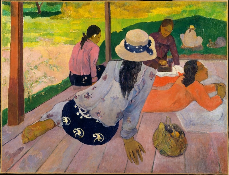
As an example of this, in The Siesta by Gauguin, we can see that there’s this garden on the left side. And if the garden is in a simple planal map way, but if the garden is similar to the original color that we see in the painting, if it’s a reddish yellow, this color leads towards that woman on the left. If, on the other hand, we take that same garden, that same area, and we make it instead of a reddish yellow, we make it, let’s say, a greenish blue. Now suddenly, instead of leading us towards the woman, it actually leads us away from her. So in this way, the change of color can change the pictorial space, can change the compositional feel, can change the movement through the work.
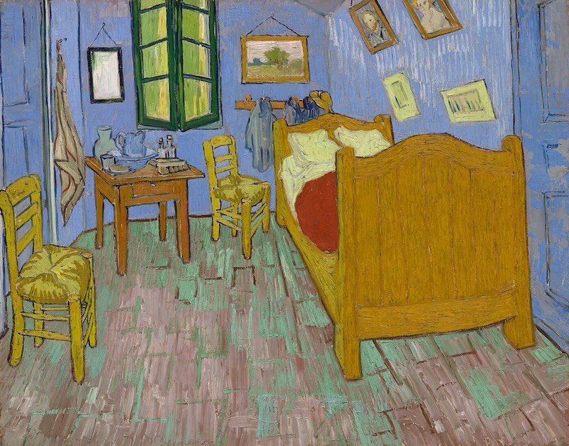
Whistler’s Mother is a very monochromatic painting. There’s only a small amount of color in it. It works more through value contrast and tones. So what would happen if we brought color into it? How well would this composition support a colorful feel? We can use this same technique of planal maps to ask questions about our own color compositions. What colors and spatial relationships do we want? How do we control the space and the color? In this case, let’s use a much more colorful painting that was painted at a similar time. Whistler’s painting is from 1871. Bedroom in Arles by Vincent van Gogh was painted in 1888.
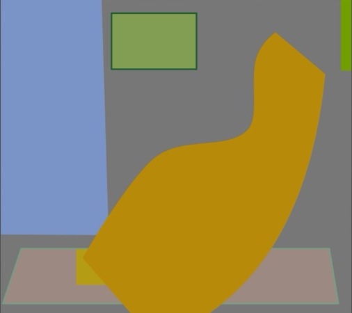
Let’s start giving color to a few of the planes in the painting. The reddish yellow of the bed frame is a pretty central and important color, so let’s use that for the mother. Let’s use the blue of the wall for the kimono. For the pictures on the wall, we can use the greens from the window. Let’s add in the footrest and some idea of the floor. We can use similar colors for the floor. And for the footrest, let’s grab this color from van Gogh’s chair. Now we have a nice variety of color here.
The first thing I notice about this is how well Whistler’s composition supports these colors. The originally very somber, tonal, monochromatic painting is now colorful and vibrant. An important question to ask is, does this newfound vibrant, colorful language change the story that’s being told? It certainly changes how it’s told in that it’s much more colorful and vibrant, but does it change the fundamental story itself? And is that a change that we want to make happen? Let’s try changing a few colors and see what happens.
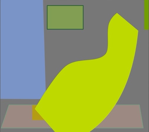
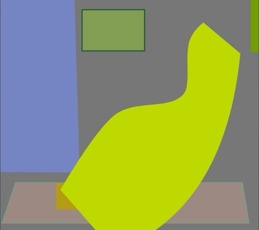
Right now, the mother is a deep reddish yellow. Let’s change that to a greenish yellow. Doing this brings up some tension with the kimono, which is slightly leaning towards red. We can make this tension clearer by moving the color of the kimono slightly further towards red. That’s making the relationship and the conversation clearer.

Now let’s change the color of the kimono to a greenish blue. With this change, we can see the mother and the kimono in harmony once again.
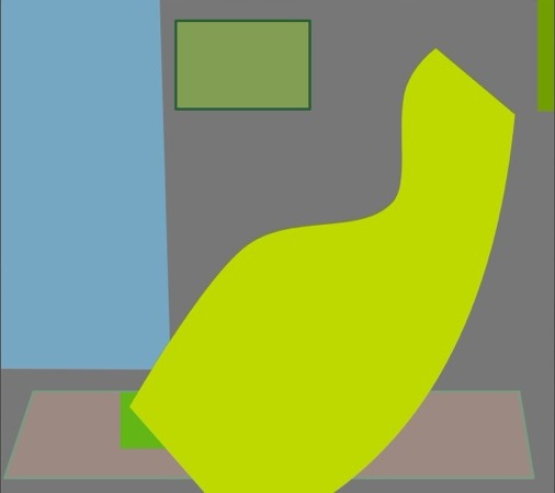

There’s a lot more things we can play with. For example, the color of the footrest becomes very important as we discuss the colors of the mother and the kimono. We can choose colors that either harmonize or add tension to the relationship. The color of the frame on the edge of the painting can also provide some creative opportunities. We can ask how changing this color affects the question of exiting the painting and the kind of pressure it exerts on the movement back into the painting. As you can see, there’s a lot that we can do with bringing color into a painting. We can use the idea of a planal map to give us a very easy entry into that world to, okay, I’ve got my basic outline of my painting. Let’s play. Let’s throw different colors into it. Let’s try different ideas.
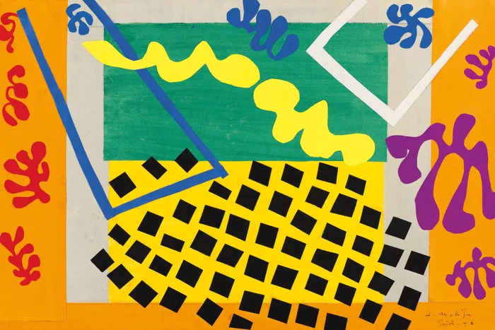
One of the most striking things for me is how we took this very monochromatic painting by Whistler. We took colors from Van Gogh and suddenly it ended up looking like a Matisse. Well, that tells us something. It tells us that, as we know, Matisse was a great student of the history of art. He really knew what had gone before him. He knew the lessons and he had learned a lot and he applied that into his own work. And I think that’s part of why he was able to advance art so much. So maybe it’s not so surprising that the colors that we see in Van Gogh, now we see in Matisse.
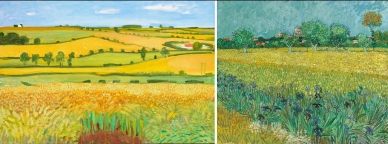
Perhaps in a similar way to the colors that we see in Van Gogh and Matisse, we also see in David Hockney. There’s a connection and a a growth, a lineage, a line that we see through the history of art. Artists learning from each other. Our work grows one from the other.
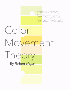
In a similar way that my book, Color Movement Theory, it’s a new idea in color. It’s a new way of thinking about color, but it didn’t come from nowhere. It grows from other color theorists. I look at the artwork of artists that have come before me from all around the world, and a new idea of color, of the language of color, the understanding of color grows. But of course, it doesn’t come out of nowhere. It grows through this fertile ground, through this history, through understanding that those have come before us, and building on that, and working with those ideas, and struggling with those ideas, and asking questions. In Planal Maps, in working with color like this, we want to ask questions. We want to ask what if. What if we did this? What if we did that? And so when we’re looking at artwork, we can understand so much more. We can ask these questions. We can wonder, and we can gain insight into what’s happening. It’s not necessarily saying, oh, the artist should have done something else. The artist should have done this instead of that. It’s more that as we ask these questions, we, yes, we can think, what else might they do? But we can also really gain insight into their genius, into, wow, they chose this, and if they had done that, it wouldn’t work that way. If they’d done this, maybe it wouldn’t have worked that way. Or, it’s a different solution, it’s a different idea. It’s saying something else. By choosing this way, they’ve chosen to say this. This is what they wanted to share. So asking these questions allows us to understand much more.
Color Movement Theory, is a new idea of how we can think about color, how we can understand the relationships of color, the language of color. Colors speak through their movements in relationship to each other, and we can understand this language, and we can use it in our own work, and we can use this understanding to understand other artwork. In my book, I go through many, many examples of famous artworks, and I analyze how they use color, and I ask questions. What if they had done this? What if they had done that? And it’s finding examples that let us understand this language. You know, it’s always challenging to find these examples, because they’re too complicated an example, and it’s saying too much all at once, and we can’t understand it. But too simple, maybe there’s not enough to say. So sometimes we want a simpler example. Sometimes we want a more complex example.
As we go forward, we start to get more and more complex. Towards the end, I go into a whole chapter on Ruben’s The Lion’s Den, and I explain how in the painting, Daniel in the Lion’s Den, Rubens uses color to tell the whole story. The way he moves us through the painting, simply with color, tells the whole story of Daniel in the Lion’s Den, which is really amazing. There aren’t many paintings that accomplish that, that can tell the whole narrative through the movement of color. So I hope you will take a look at the book. I know it’s been a very useful resource for a number of my students. I’ve really seen an incredible amount of growth from students who’ve really worked through the book and developed their understanding of color, and developed their own use, their own way to speak through color.
Artwork:
Link to James McNeil Whistler, Whistler’s Mother at the Musée d’Orsay https://www.musee-orsay.fr/en/artworks/arrangement-en-gris-et-noir-ndeg1-974
Link to James McNeil Whistler, Whistler’s Mother on Wikipedia https://en.wikipedia.org/wiki/Whistler%27s_Mother
Paul Gauguin, The Siesta
https://www.metmuseum.org/art/collection/search/436449
Vincent van Gogh, Bedroom in Arles
https://www.artic.edu/artworks/28560/the-bedroom
Matisse, Les Codomas
https://www.moma.org/collection/works/105389
David Hockney
https://www.hockney.com/home